Figma and MasterGo Basics
Core Question
How do you start using modern design tools from scratch to build web prototypes?
1. Why learn frontend design tools?
Before we begin, we need to answer a simple question: why bother learning frontend design tools at all? If you can already build pages with HTML and CSS, is it really necessary to learn one more tool?
In practice, "making a page run" and "designing a good product" are two different things. Code focuses on how something renders in the browser and how it behaves across devices. Design tools focus on how information is arranged, how interactions are sequenced, and how visual priority is communicated. With a single canvas, you can compare layout, information hierarchy, and interaction patterns on one screen before writing code.
If you jump straight into implementation or ask AI to generate a full frontend page immediately, the user experience is often rough. Serious products think carefully about comfort, hierarchy, and communication across different screens. A better workflow is to arrange the interface first from the user's perspective, then convert or generate the code.
From a collaboration standpoint, design tools also reduce coordination cost. Designers, product managers, and developers no longer need to imagine the same screen from vague explanations or abstract code. Everyone can discuss versioning, requirement changes, and feedback around a visible, annotatable, iterative canvas. Modern design tools are no longer just drawing software either. They can generate part of the code, manage design systems and component libraries, and automate repetitive work such as alignment, annotation, exporting, and style changes.
1.1 The evolution of frontend design tools
Frontend design tools are the result of a long evolution. In the 1990s, Photoshop dominated with local bitmap editing. Around 2010, Sketch introduced vector-first, component-oriented workflows. After 2016, Figma pushed collaboration into the cloud and turned solo design work into real-time teamwork. By 2025, AI had become a practical part of these tools, from "generate a draft from one sentence" to "turn a design into runnable frontend structure." "Design as code" and "human-AI co-creation" are no longer just slogans.
In this chapter, we will focus on two representative modern design tools: Figma and MasterGo. They both cover the core abilities needed for modern UI and UX work, including vector editing, component systems, auto layout, and developer handoff. They have also both added practical AI features that help turn a prototype into a runnable interface without changing the overall design intent.
1.2 How this toolchain emerged
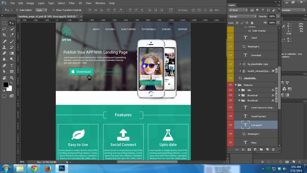
Before dedicated interface tools existed, UI design was largely handled by "general-purpose" design tools such as Photoshop. Designers built entire interfaces locally using layered PSD files, then handed those heavy source files to frontend engineers. To recreate the design accurately, frontend engineers had to do three tedious but essential jobs manually.
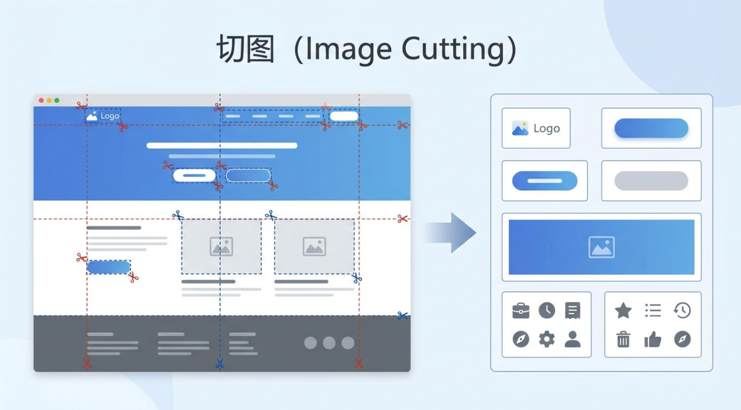
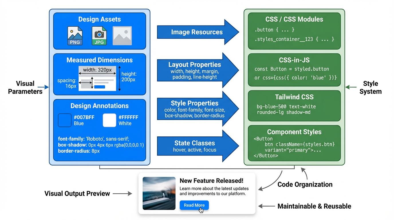
The first was asset slicing: extracting buttons, icons, logos, backgrounds, and other visual elements one by one from a PSD file, then exporting them as PNG or JPG files the web could actually load.
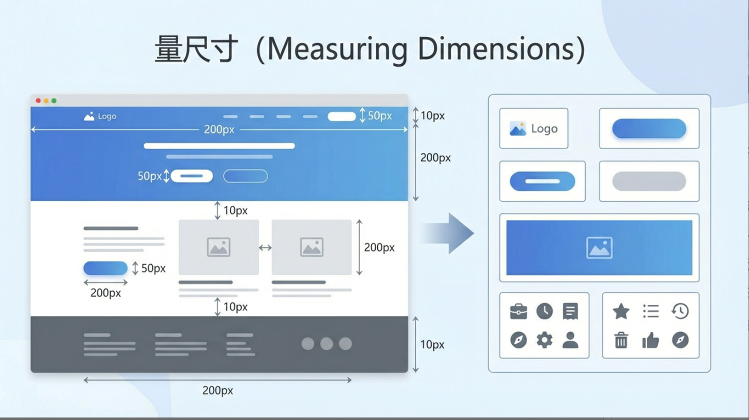
The second was measuring dimensions: manually checking widths, heights, and spacing between elements to ensure everything matched the design pixel by pixel.
The third was reading annotations by hand: pulling out the "invisible but required" design parameters such as font size, font weight, line height, RGB or HEX colors, shadows, and so on.
Only after that did actual frontend implementation begin. Whether the stack is plain HTML/CSS/JS or frameworks like Vue and React, the core process is similar. The frontend rebuilds the page around containers, based on the hierarchy and semantics of the design. A container is a layout boundary that organizes child elements without directly being the final content itself. Structural blocks such as top navbars, sidebars, article lists, and footers rely on containers; inside each block, smaller containers arrange finer elements such as titles, descriptions, timestamps, or thumbnails.
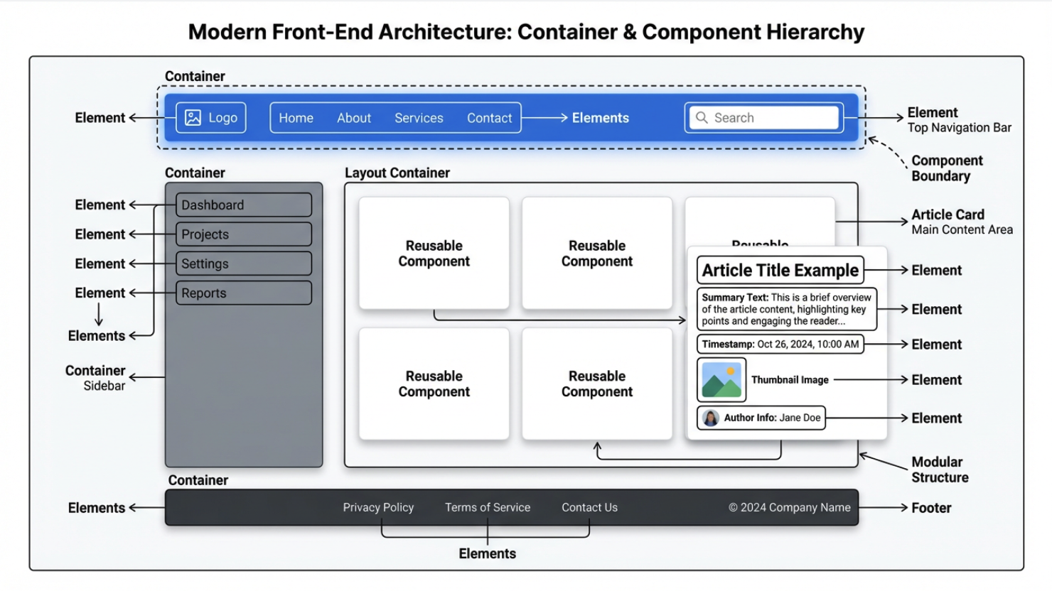
In modern frontend frameworks, these structural blocks are typically implemented as components. A component is a reusable interface unit with clear boundaries. It includes both layout containers and interaction logic. Any repeated piece of design, such as a consistent button style or a reusable article card, can be abstracted into a component so it can be reused across different pages while keeping layout and styling consistent.
The styling layer then restores the visual appearance. Exported image assets become <img> tags or background images. Measured dimensions become CSS properties such as width, height, margin, padding, and line-height. Typography, color, shadow, border radius, and hover or active states become CSS, CSS Modules, CSS-in-JS, or Tailwind rules. At this point, exported assets and annotations provide the visual parameters, while components and structural blocks provide the code organization that makes the interface maintainable and reusable.
But the local-file workflow was fundamentally inefficient. Versions were sent through email or cloud drives, old and new drafts were easy to confuse, and collaboration required a lot of manual coordination.
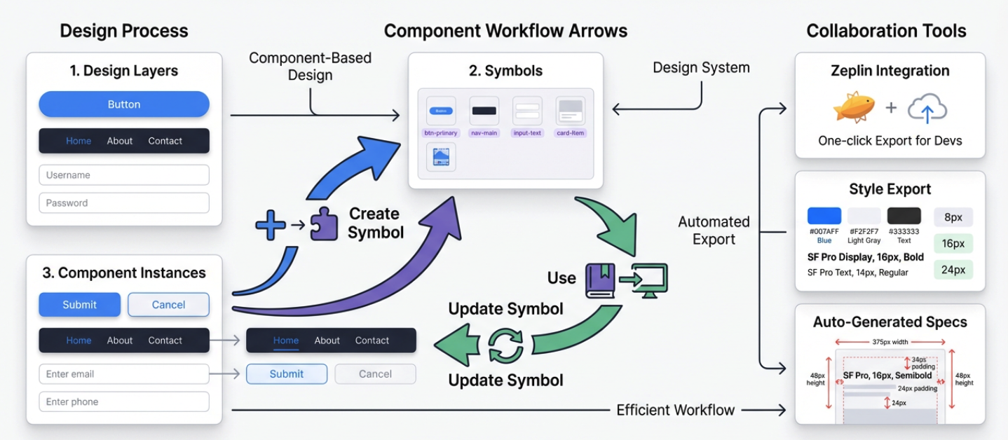
As mobile interfaces became more complex and iteration speed increased, Photoshop's "do everything" model became too heavy. Sketch appeared in this phase. It focused on UI work itself, introduced Symbols for highly reusable elements such as buttons and form controls, and paired well with tools like Zeplin for automatic annotations and style snippets. Sketch brought component thinking into design workflows. Still, it remained a desktop tool built around local files, so real-time collaboration never became native.
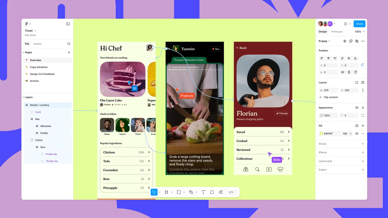
Figma truly changed the game. Starting in 2016, it unified UI design, prototyping, comments, and version history in the browser, with multi-user cursors, online comments, timeline history, and shareable links.
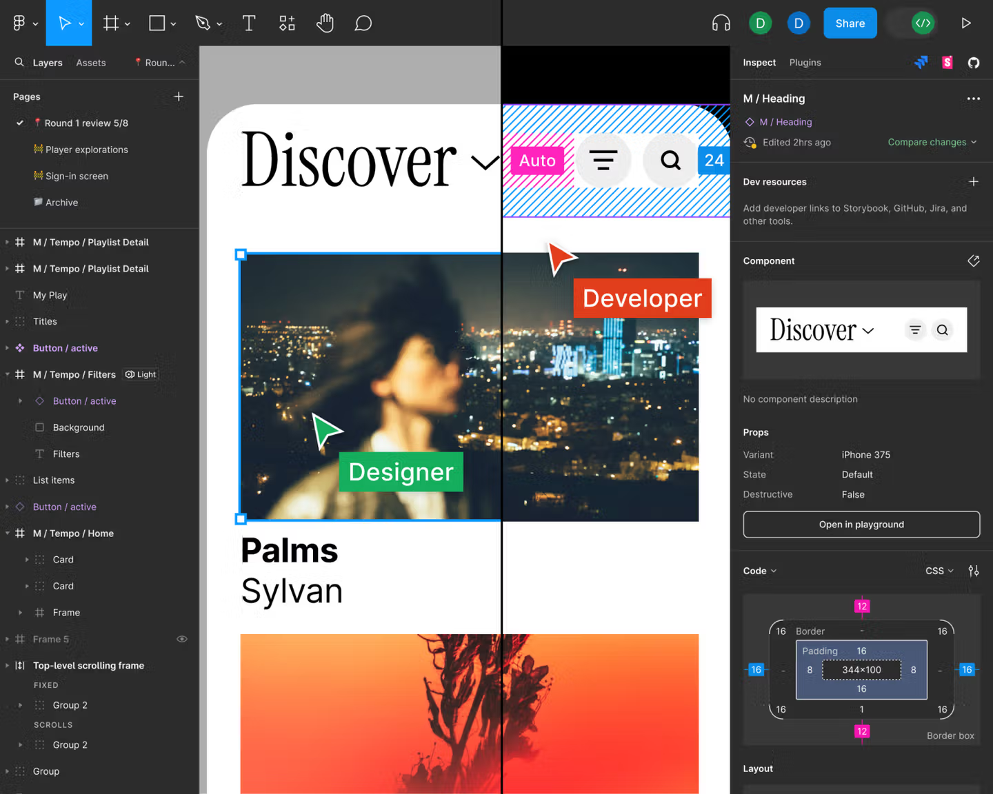
From that point on, interface design was no longer scattered across separate machines. It became a shared online canvas that updated in real time. Once that happened, the boundary between design and frontend code became easier to blur through automation and AI.
At first, plugins could only semi-automatically export components and style information into code snippets such as React or Vue skeletons and CSS variables. Later, design platforms began to support MCP, the Model Context Protocol, which gives language models a standard, controlled way to access design files, plugin interfaces, and project metadata. That makes exporting designs into code much more direct.
The next step after plugins and MCP is native design-to-code generation. Today, some tools can generate project skeletons, component hierarchies, style systems, and real code directly from a design. That frees designers and frontend engineers from manually transferring details and gives them more time to focus on user experience and feature iteration.
2. Figma basics
Now let's move from concepts to hands-on work. Because of time, we will only cover Figma's core interaction model. The goal is simple: even if you have never used a design tool before, you should be able to follow along and complete the exercise. If you want a more complete walkthrough, you can study Figma's official beginner documentation:
https://help.figma.com/hc/en-us/sections/30880632542743-Figma-Design-for-beginners
You can also look at Figma's site-building examples:
https://help.figma.com/hc/en-us/sections/35895585621655-Figma-Sites-collection
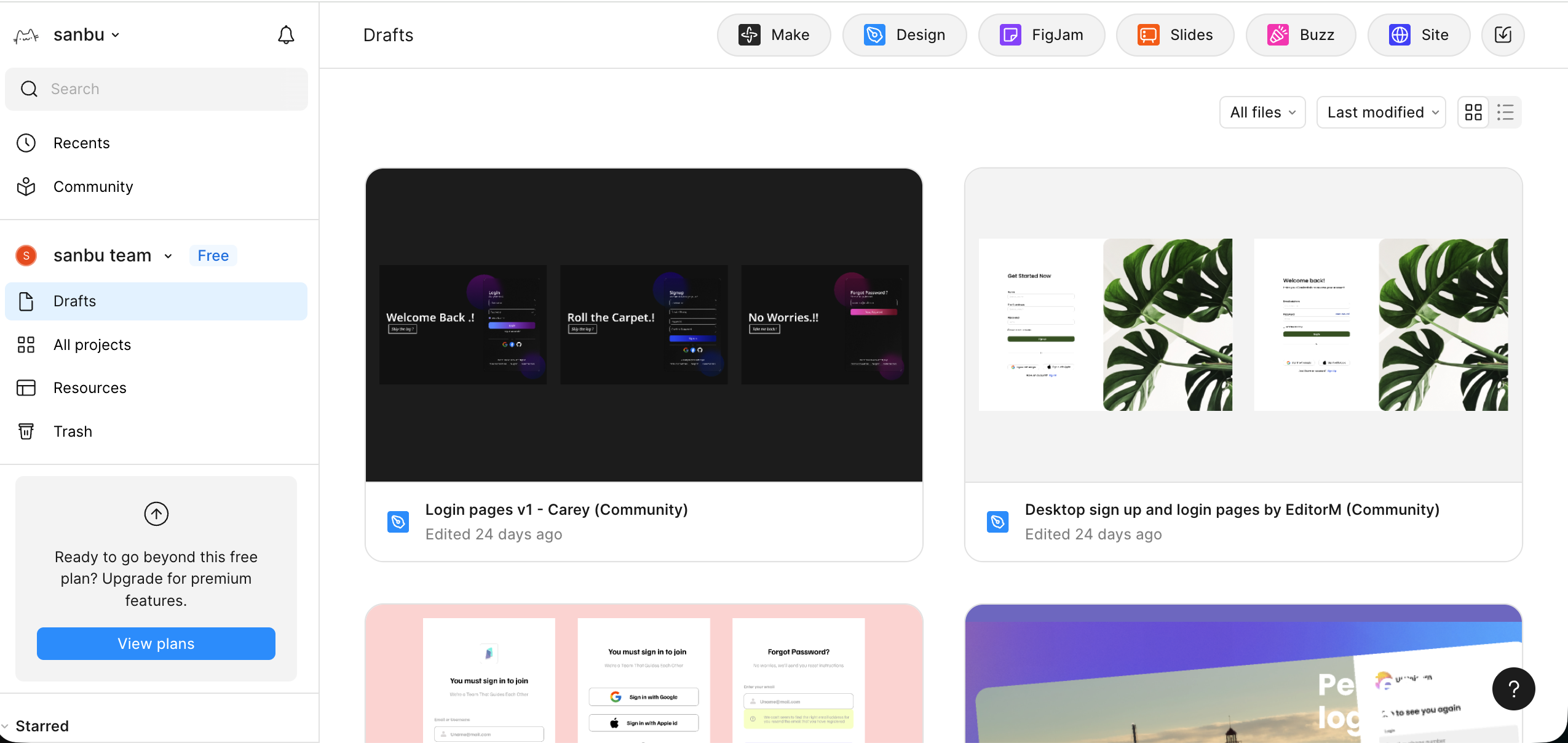
On the left is project creation and resource management. In the top-right area, you will see several common entry points. Make lets AI generate a rough interface draft from one sentence. Design is the main workspace where you build app and web interfaces, components, and prototypes. FigJam works like a team whiteboard for notes, flows, and early discussions. Buzz is for brand-scale asset production. Site is for publishing designs as accessible websites or documentation pages.
At first glance, Figma looks complex. But tools like this become familiar through repetition. You do not need to be afraid of making mistakes, and you do not need to get everything right on the first try. The key is to start playing with it.
In this tutorial, we will focus on the Design workspace.
2.1 Create a new Design file
From the homepage or the top-right entry, choose Design to create a new file. You will enter a blank canvas.
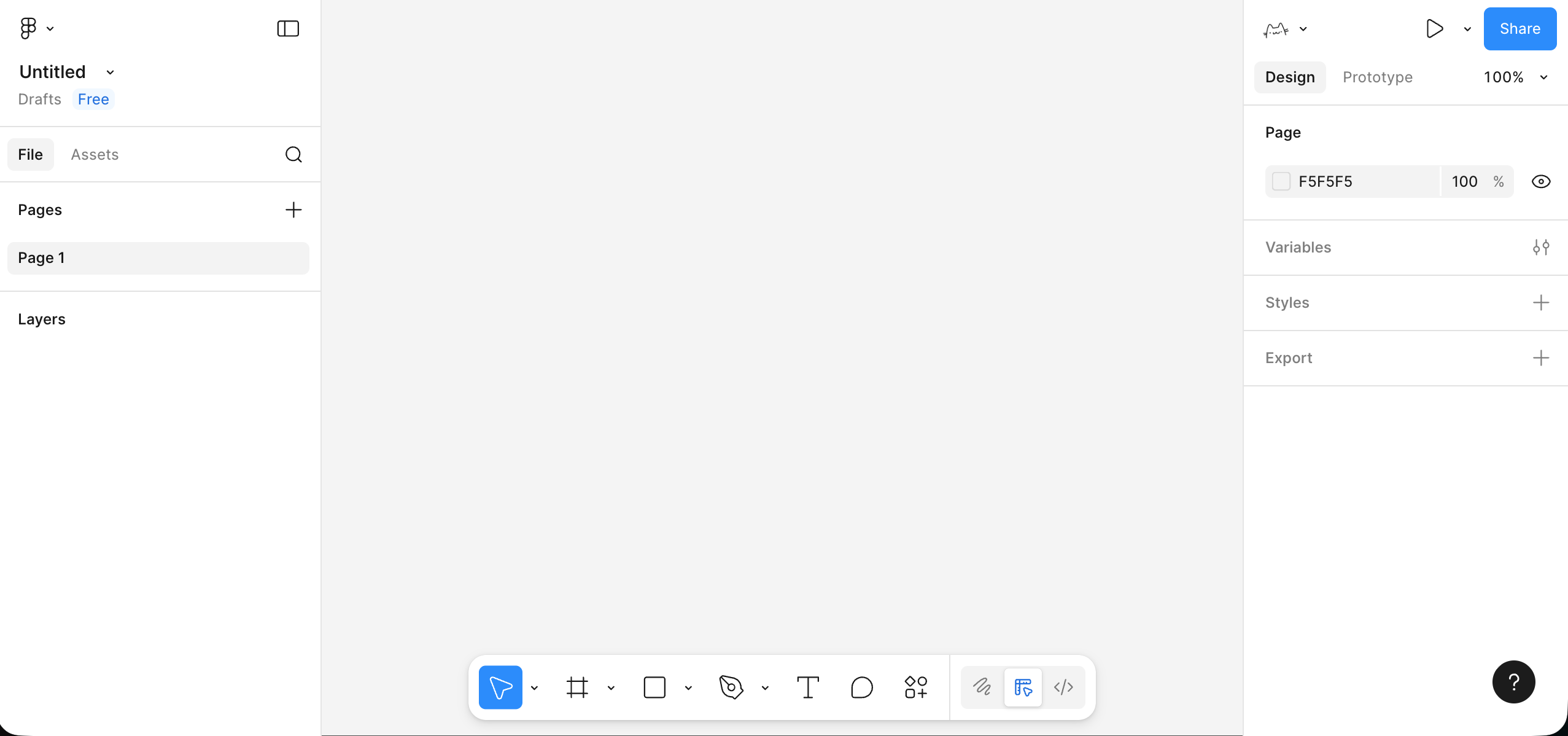
This interface is roughly divided into three areas:
- The left side shows pages and layers so you can inspect the structure of the page and the hierarchy of elements.
- The middle area is the canvas where you view and arrange the current design.
- The right side is the properties panel where you change shape, color, and style details.
- The toolbar lets you switch between selection, shapes, text, comments, and plugins. After selecting a tool, you can press
Escto return to the default pointer.
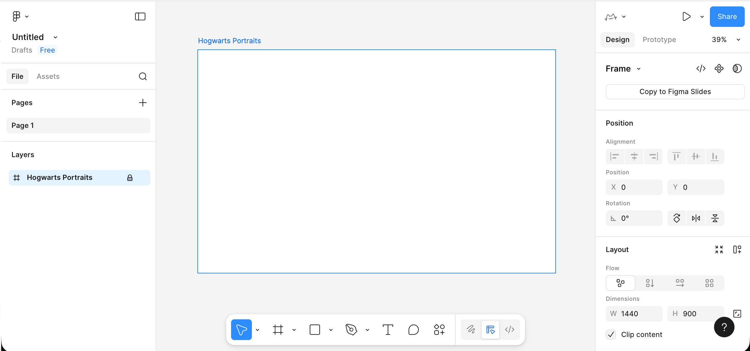
2.2 Create your first Frame
Before placing elements, we need a clear page boundary. In Figma, that boundary is handled by a Frame. You can select the Frame tool or press F, then drag out a rectangular region on the canvas.
- Use the Frame tool in the toolbar or press
F. - Drag a rectangle on the canvas and set its width to something like
1440and height to900in the right-side panel. - Rename the Frame in the layer list to something like
My First Pageor your project name.
This Frame becomes the container for one complete screen. Your title, text, buttons, and images should all live inside it instead of floating freely on the canvas. Working inside a Frame helps later with scrolling, responsiveness, exporting, and prototyping.
2.3 Add text and basic elements inside the Frame
Now that we have a container, let's place the most basic interface elements: a title, subtitle, button, and placeholder image block.
- Choose the text tool (
T) and click inside the Frame to add a title such asMy Portfolio. Increase the font size and weight in the right panel. - Add one line of supporting text under the title. Use a smaller font size and slightly larger line height so it reads more comfortably.
- Sketch out a button: Use the rectangle tool to draw something around
200 x 48, give it a noticeable fill color, and add some border radius.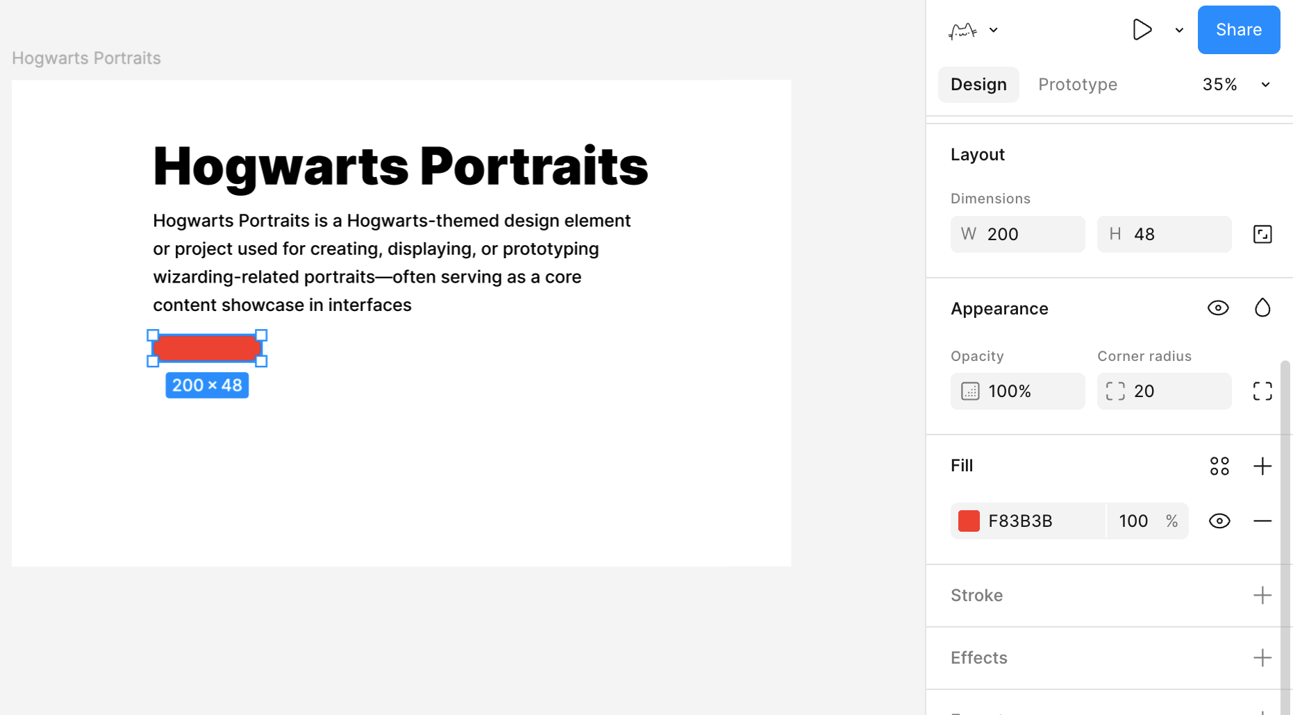
- Add button text on top, such as
Get Started, then select both the rectangle and the text and align them horizontally and vertically. - Add a larger light-gray rectangle beside or below the button as a placeholder image area.
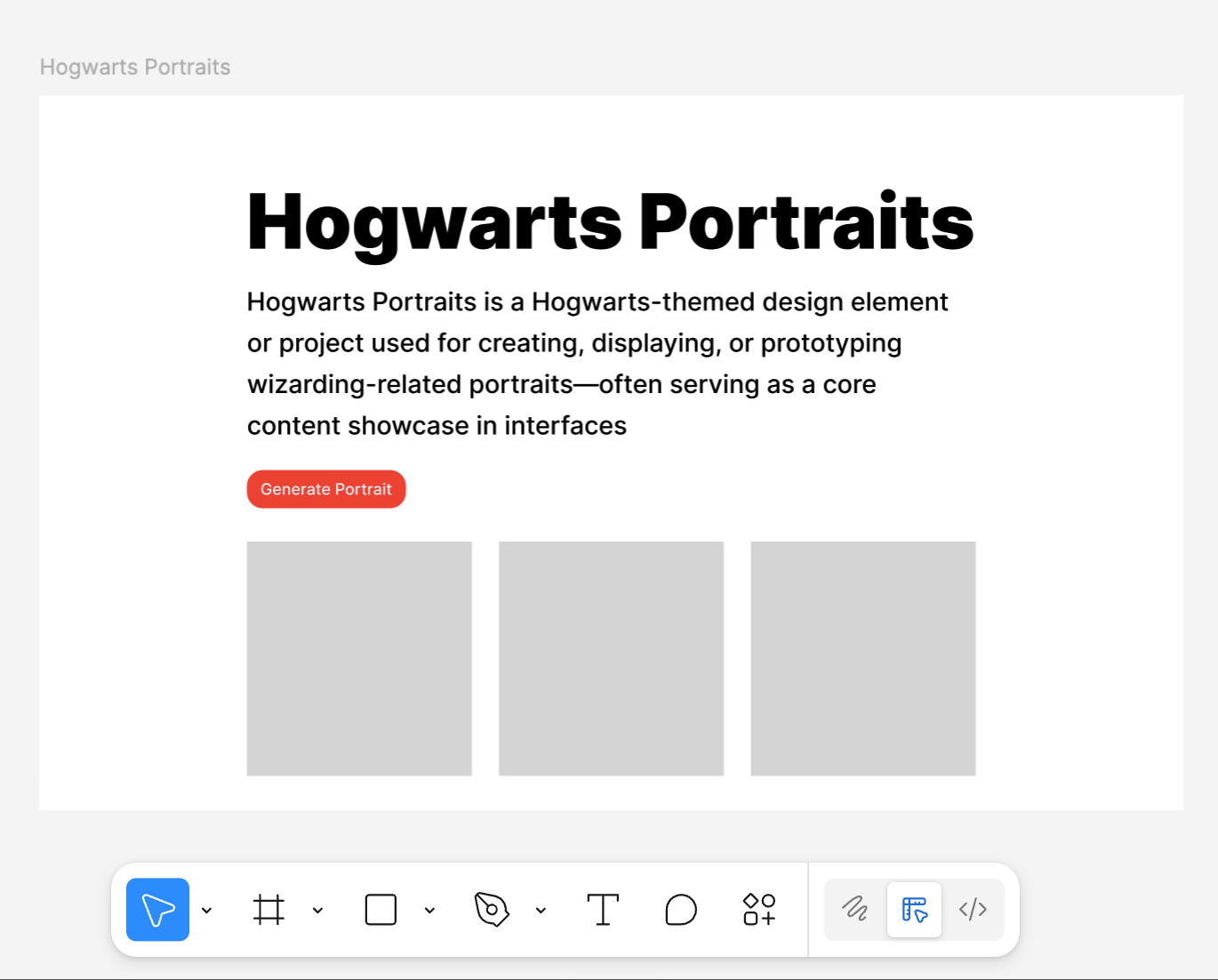
At this point, you already have a very rough but structurally complete homepage draft: a title, a piece of body text, a button, and a main display area.
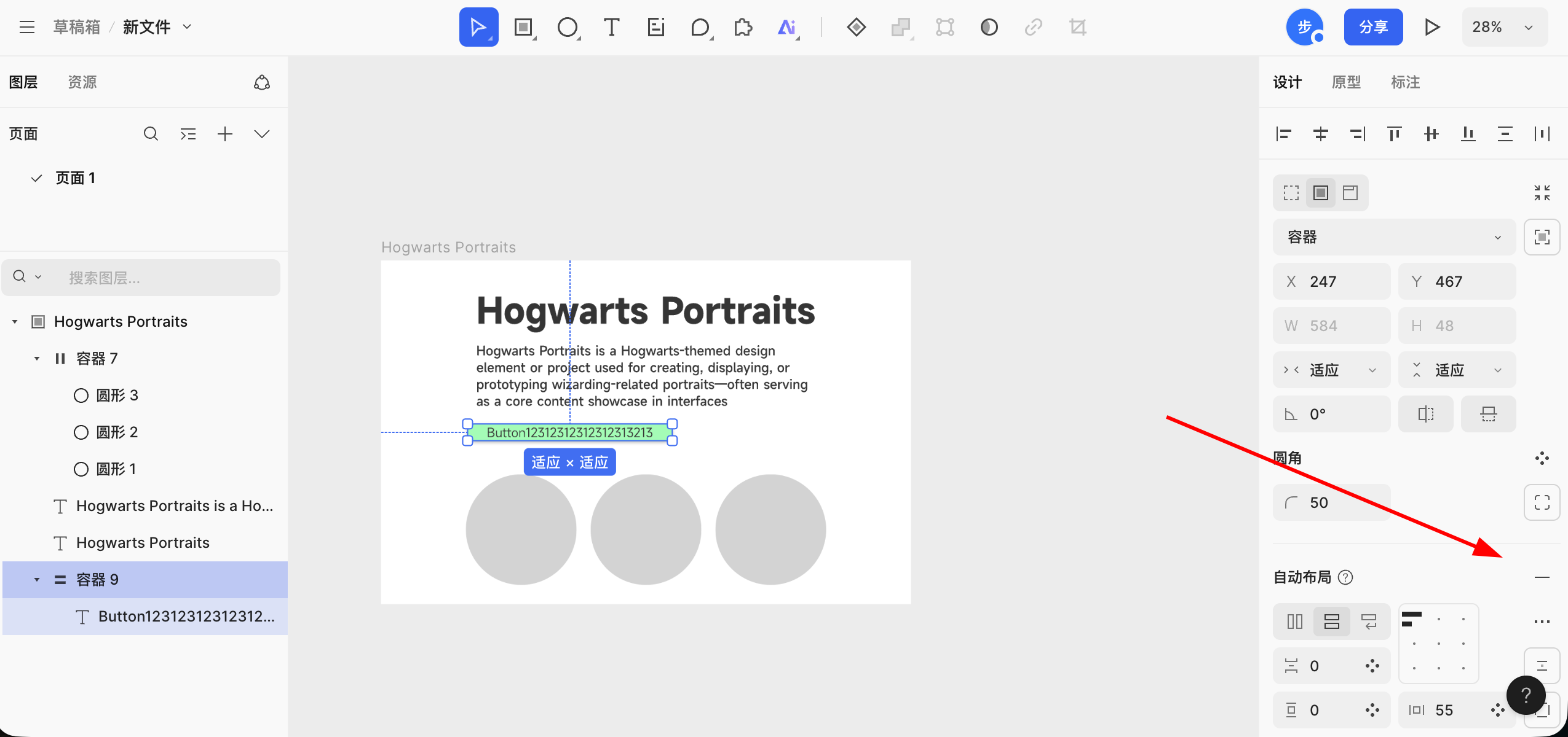
2.4 Use Auto Layout to organize elements
If all elements are positioned manually, the page becomes messy very quickly. One of Figma's most important concepts is Auto Layout, which turns a group of elements into a rule-based container.
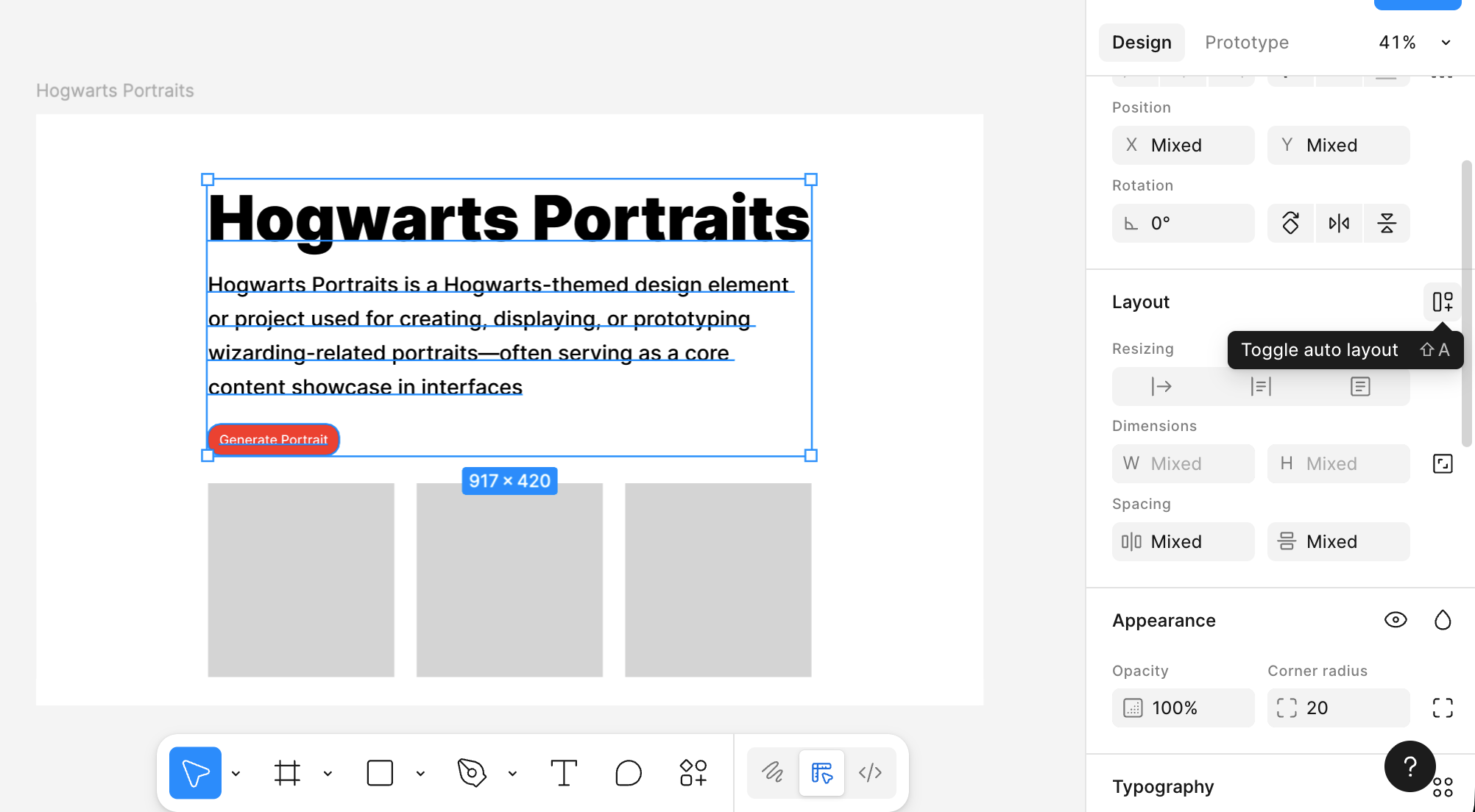
Select the main title, subtitle, and button together, then click Add Auto layout in the right panel.
Those elements are now wrapped inside a container, and you can adjust several useful properties:
- Whether the elements are arranged vertically or horizontally
- The spacing between elements
- The padding between the content block and the edge of the container
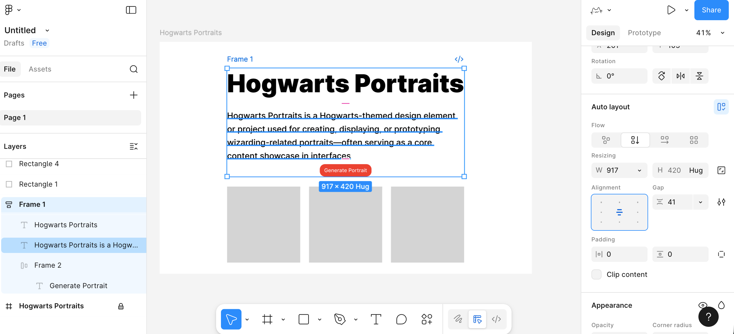
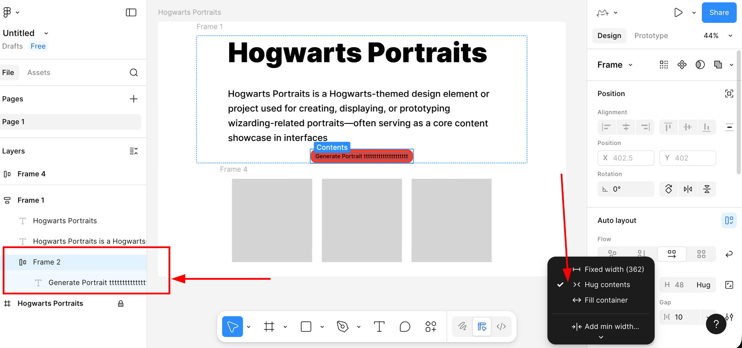
You can use Auto Layout inside the button as well. That gives you a button whose width adjusts automatically when the text changes.
Select the button background and button text, add Auto Layout, and turn them into a button container. Then set both width and height to Hug contents. Once you do that, the text stays centered and the button width grows or shrinks with the text.
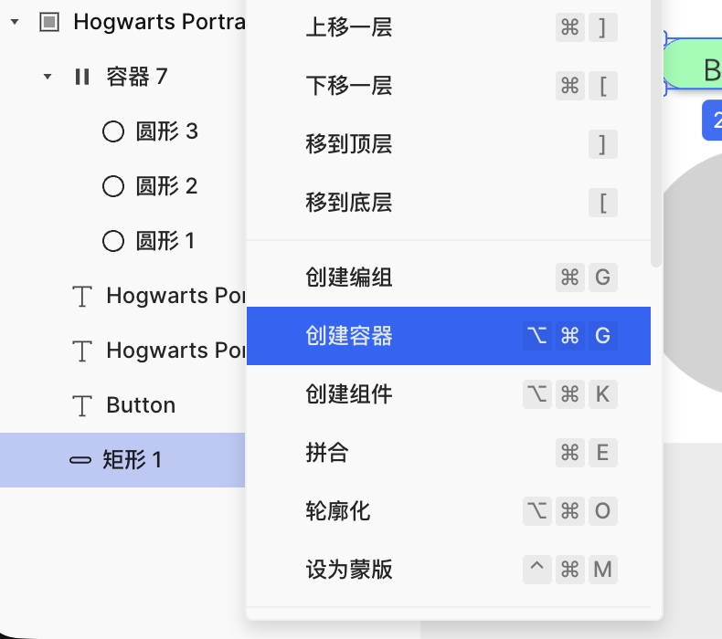
2.5 Turn the button into a reusable component
Now let's learn another important concept: components. A component is an element designed for repeated reuse. Buttons are a perfect example.
Starting from the button that already has Auto Layout:
- Select the entire button container.
- Right-click and choose Create component.
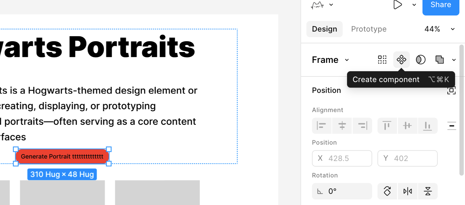
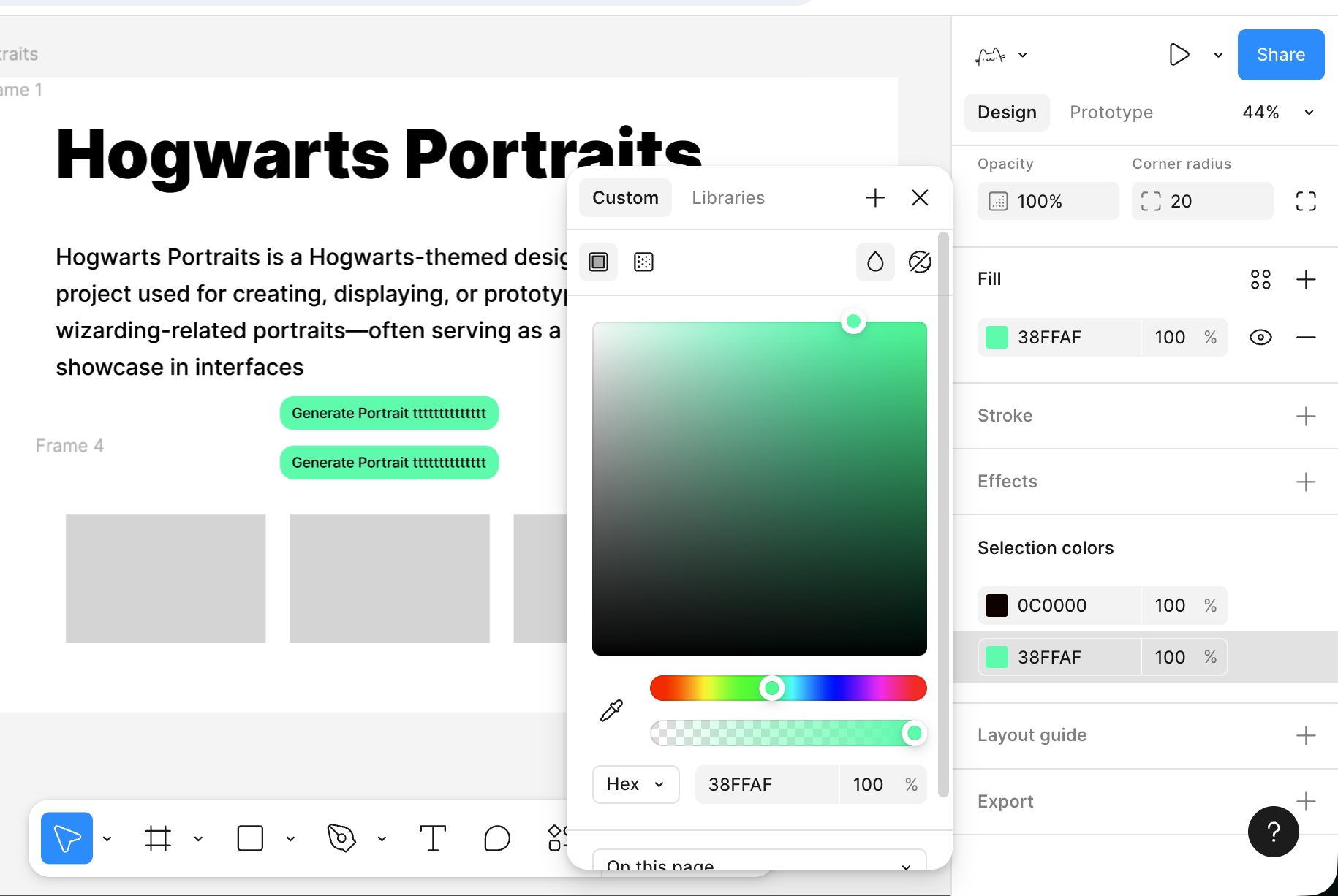
The button is now promoted from a set of ordinary layers to a component master. When you need the same button style somewhere else, you can drag it out from the Assets panel.
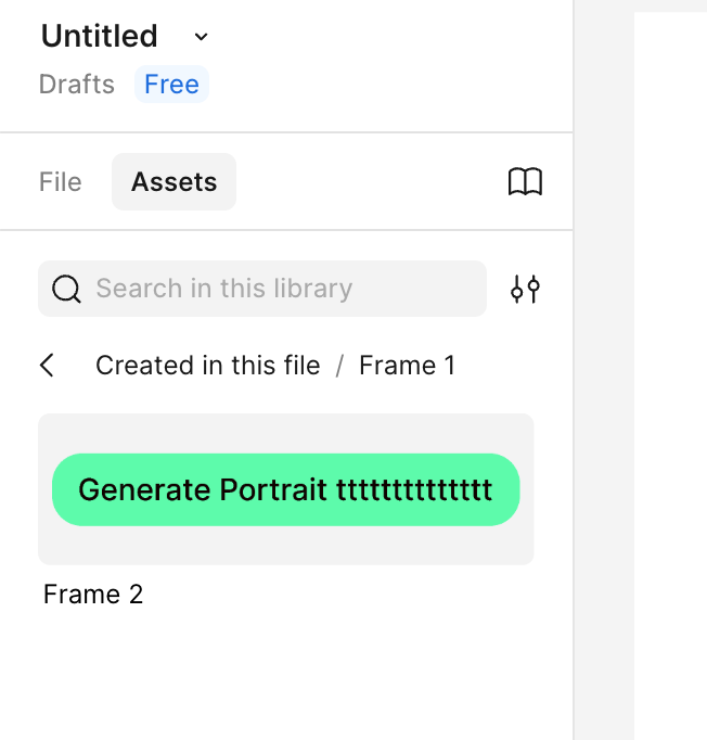
Every inserted button is now a synchronized instance of that master. If you later change the master's color, corner radius, or spacing, all instances update together.
At this point, you already understand the basic usage of Figma. You do not need to master every function on day one. Just build your first simple page, get comfortable with the core operations above, and explore more capabilities over time.
3. MasterGo basics
Once you understand the basic Figma workflow, MasterGo is much easier to approach. You can think of MasterGo as a China-focused counterpart to Figma with a few differences in product behavior. Overall, it follows a very similar layout and interaction model: canvas, layer tree, property panel, components, styles, auto layout, and multi-person collaboration. For more detail, you can refer to the official MasterGo tutorial:
https://mastergo.com/tutorials/12?全程高能,MasterGo 最完整实用教程,让你从零到精通!
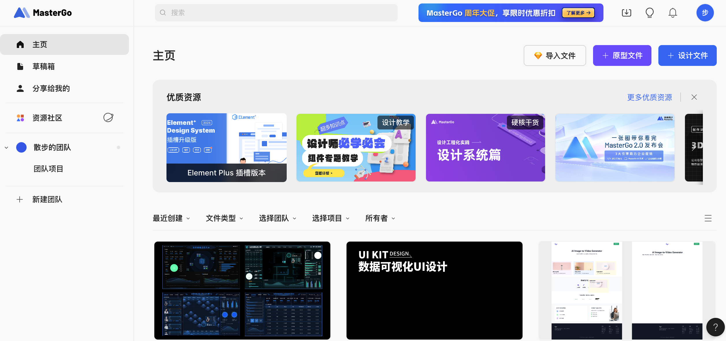
3.1 Create a new design file
Enter the MasterGo workspace
- Open the MasterGo website and sign in.
- After entering, you will see a homepage similar to a file list or project list, where your design files are managed.
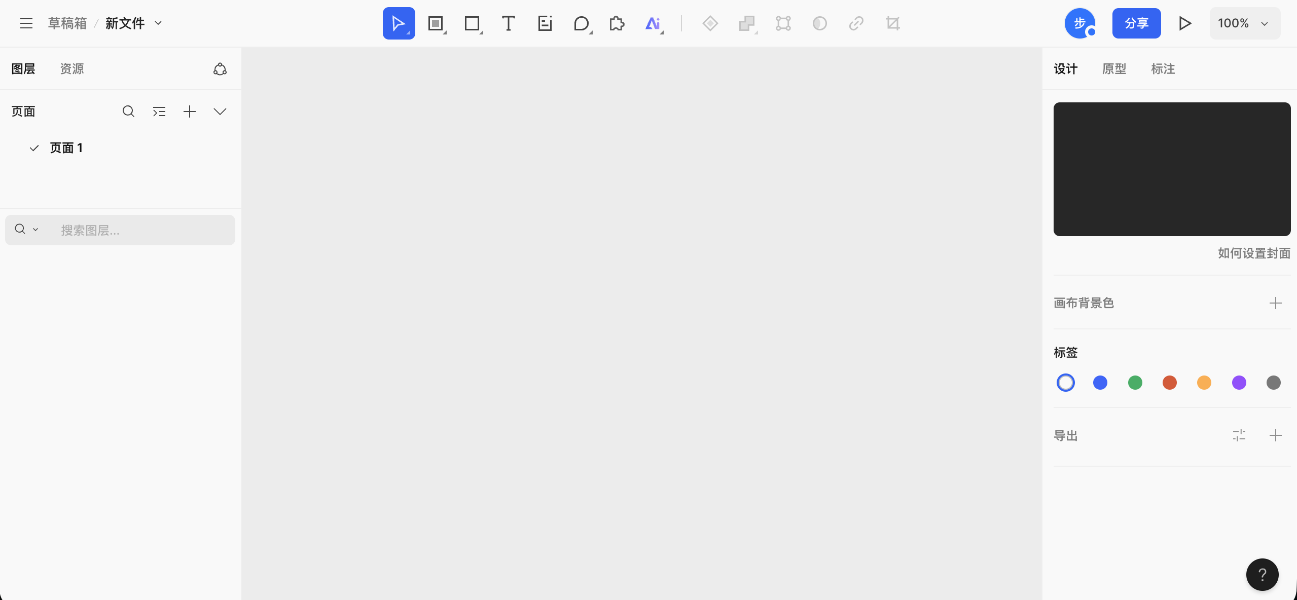
Create a new file
- Click the
+ Design Filebutton in the top-right corner, or choose to import files such as Figma files. - After clicking, you will enter a blank canvas, which is MasterGo's design workspace.
- Click the
Understand the major interface regions Once you know Figma, MasterGo feels very similar. The main areas are:
- The top toolbar: file location and name on the left, common tool buttons in the middle, and online collaborators, sharing, zoom, and preview controls on the right.
- The left panel: layers and assets, including the page list and the structure of the current page.
- The central canvas: the workspace where Frames, components, and graphics are actually placed and arranged.
- The right properties panel: used to inspect and edit the selected object's size, position, alignment, fill, stroke, border radius, and more. If nothing is selected, it shows canvas-level settings.
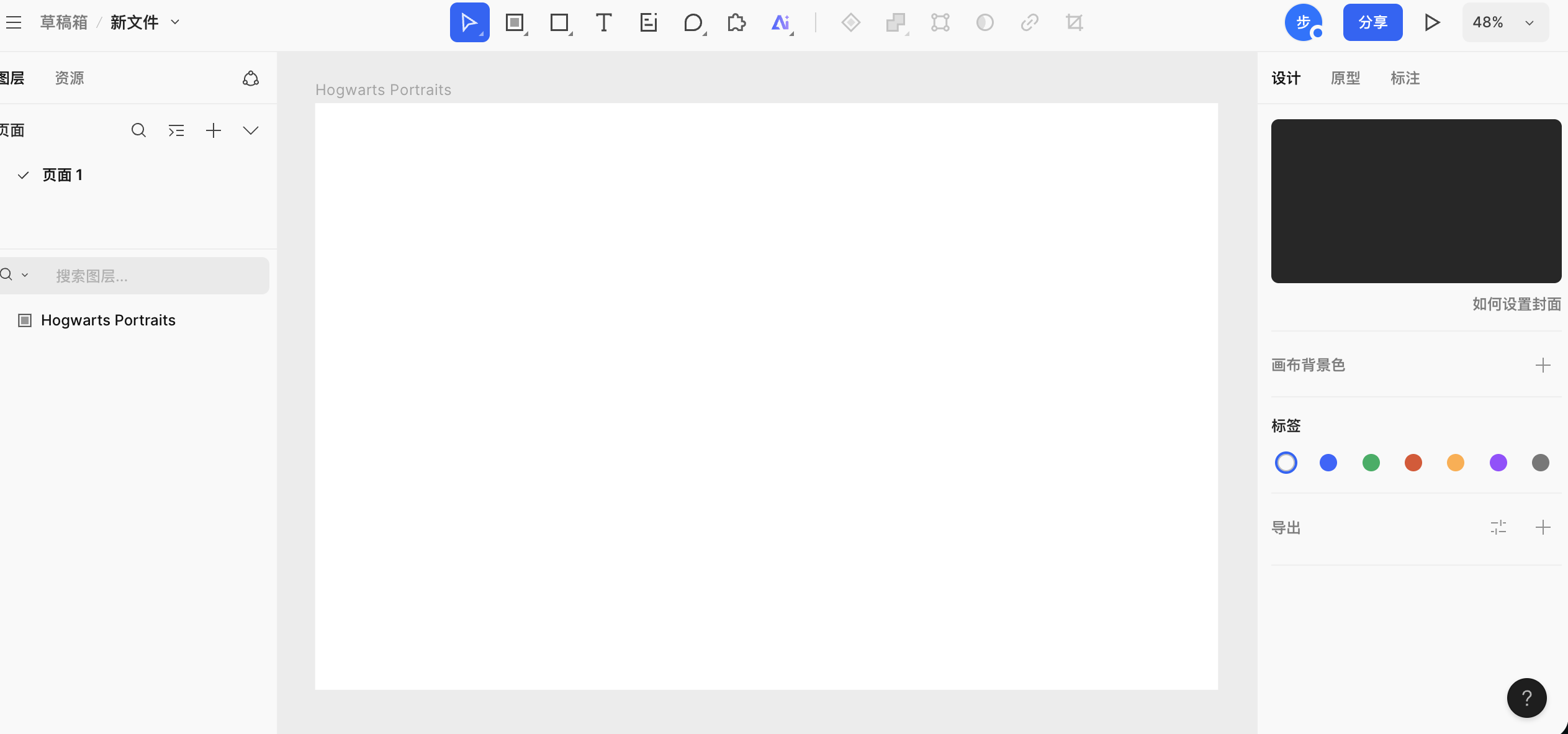
3.2 Create your first Frame
Before placing content, we need a page container to define the boundary and size of the interface. In MasterGo, this is usually called a Frame.
Steps
- Choose the Frame tool
- Find the Frame or Artboard tool in the toolbar.
- Or use the keyboard shortcut, usually
Fdepending on the current UI.
- Drag out a rectangular area on the canvas
- Once you drag it out, you will see a selected region.
- The right properties panel will show its width and height.
- Change the width to something like
1440and the height to900.
- Rename the Frame
- Find the Frame in the layer panel.
- Double-click the name and rename it to something like
My First Page.
3.3 Build content on the artboard
Once you have a container, you can build a similar page using the same ideas we already used in Figma. You can even try copying text elements from the Figma artboard directly into MasterGo.
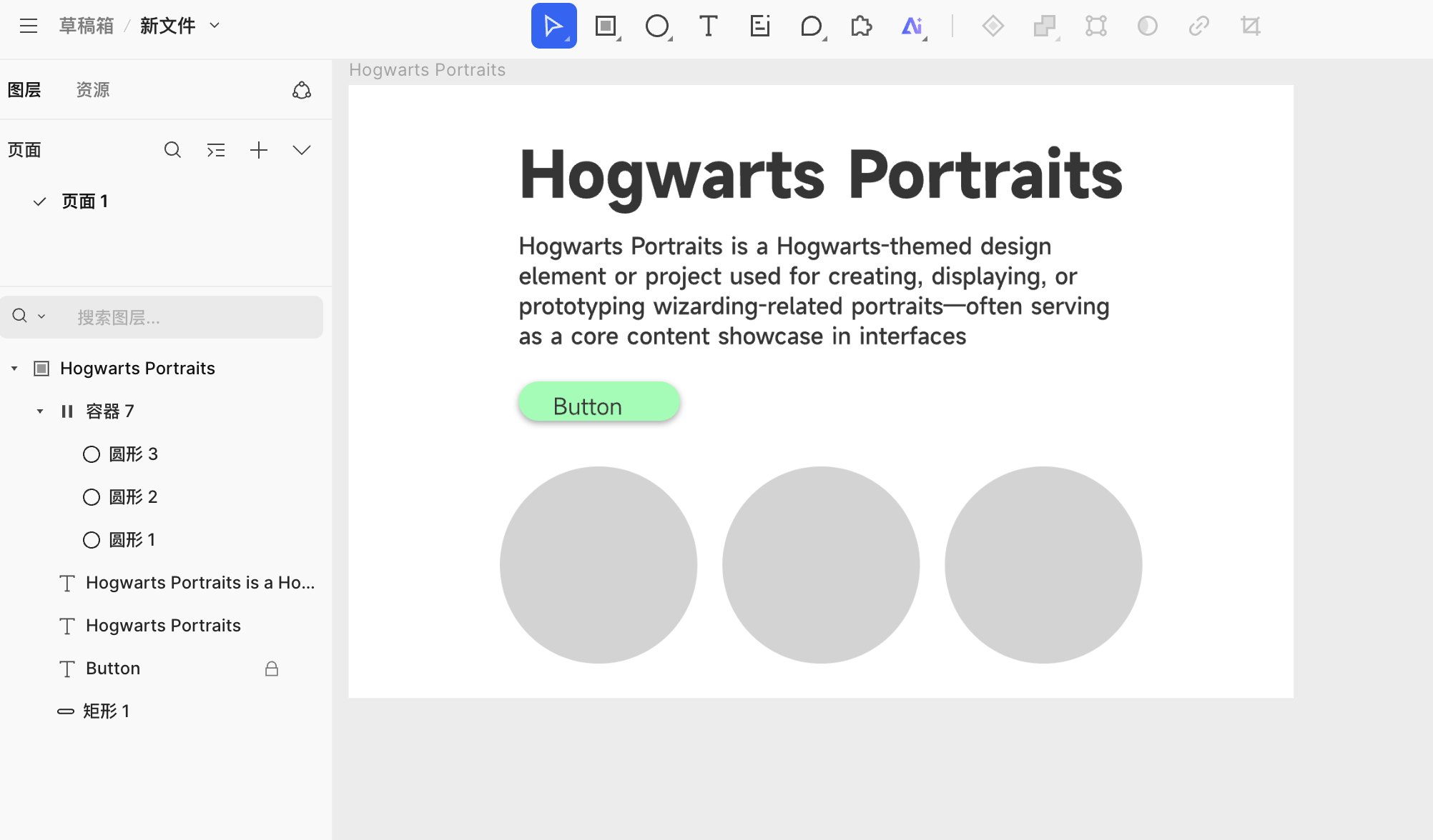
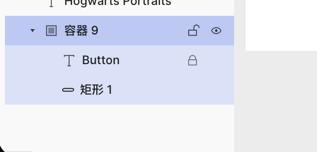
One thing worth noting is that Auto Layout behaves a little differently. In MasterGo, if you want button width to expand or shrink with the text, you first need to create a container or component around the rectangle element, as shown below:
After creating the container, put the button background and text into that shared container, then enable Auto Layout from the right-side panel. That lets the button width respond to the text length successfully.
3.4 AI-generated pages
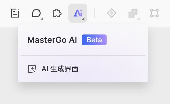
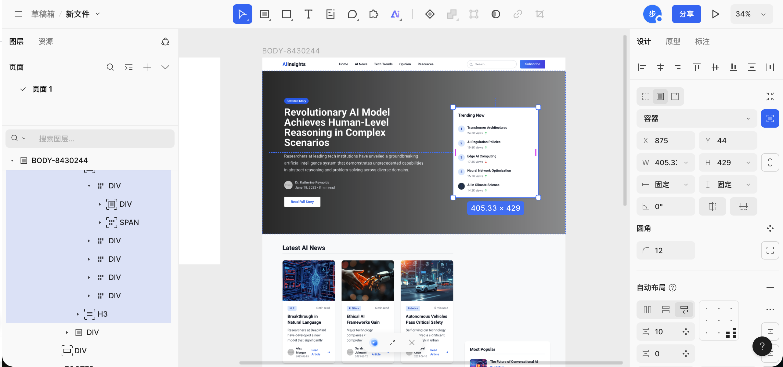
One especially interesting feature in MasterGo is AI page generation. You can enter a sentence or provide a reference image, and MasterGo can generate editable components and code for you. You can write the prompt in either Chinese or English. The system will return a clearly structured page draft based on your request.
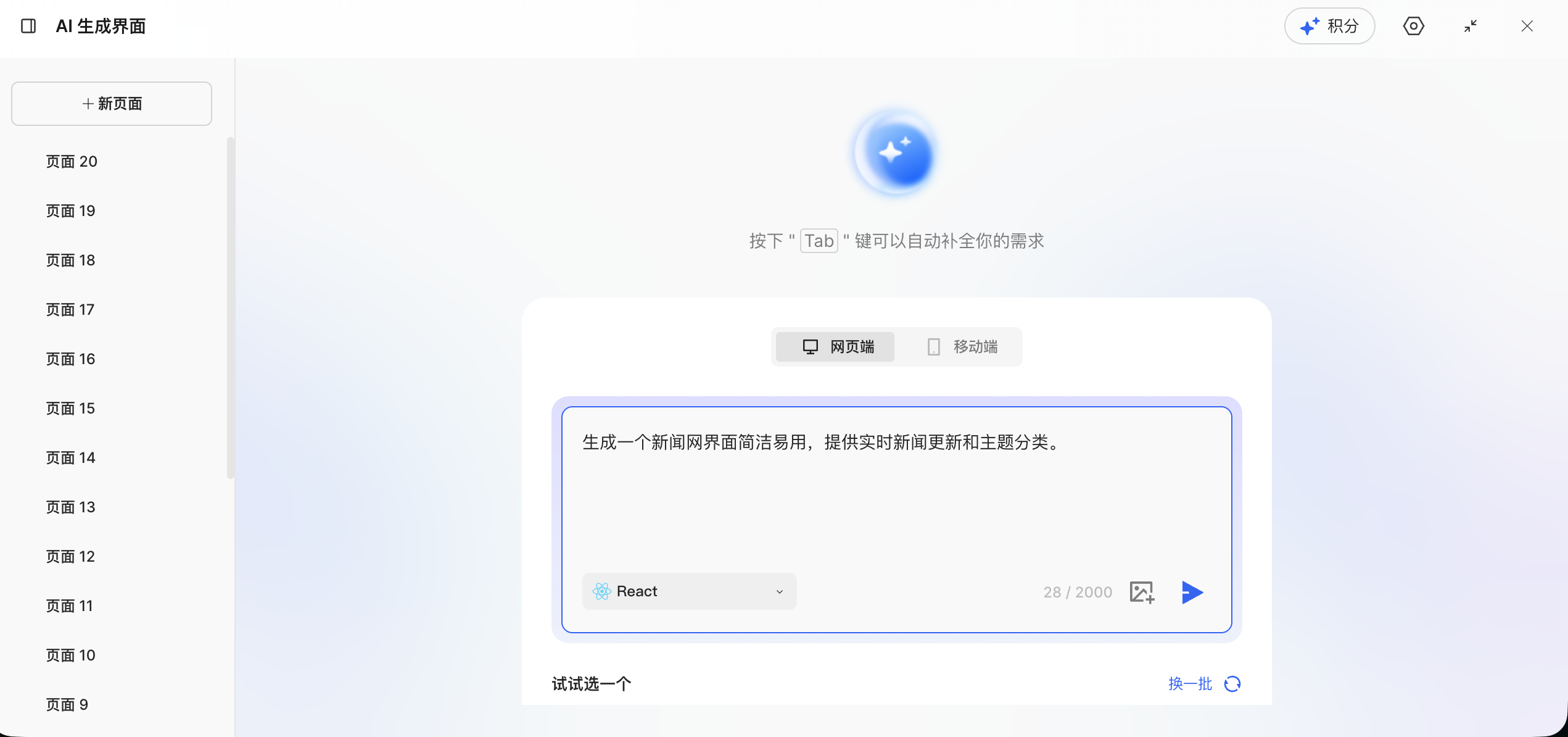
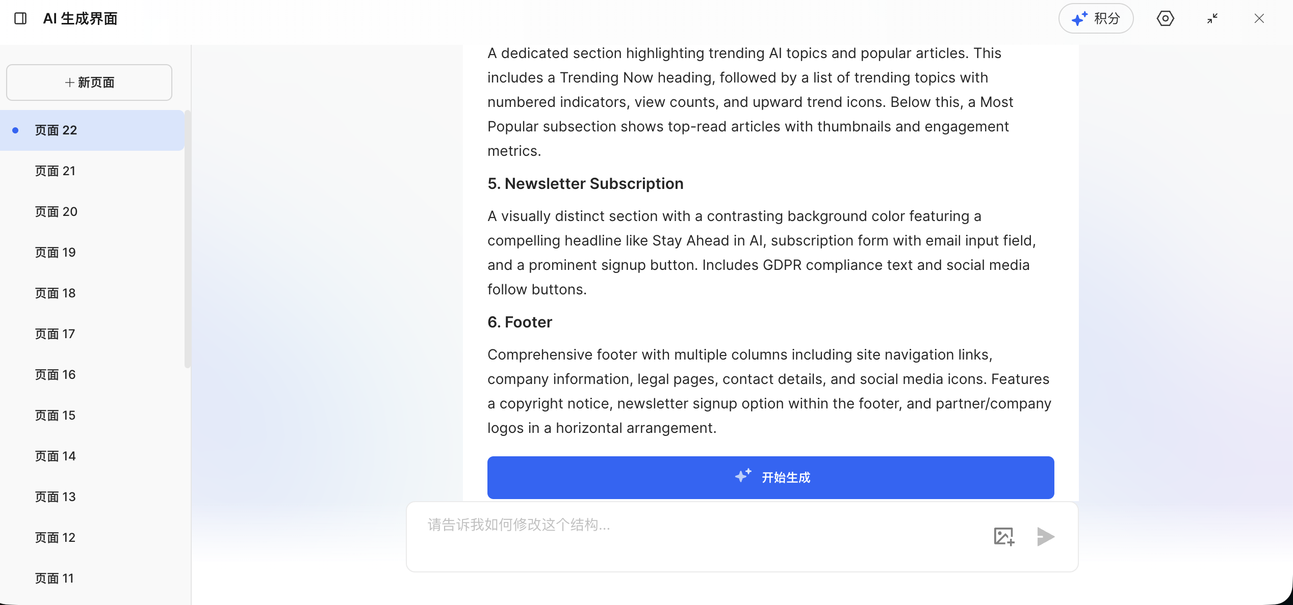
Once the design document is generated, click to start generation and wait briefly for the rendered result:
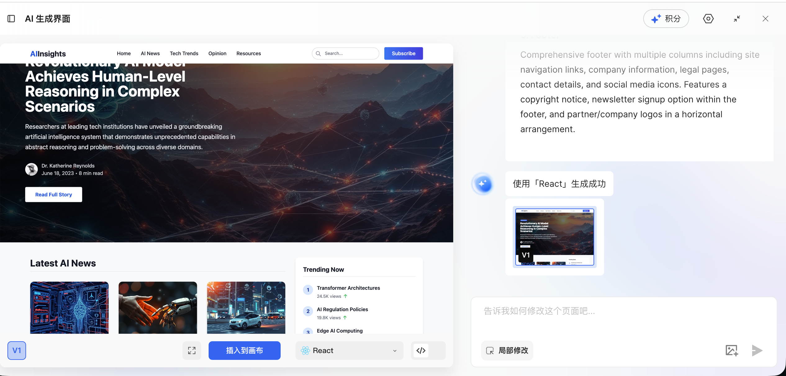
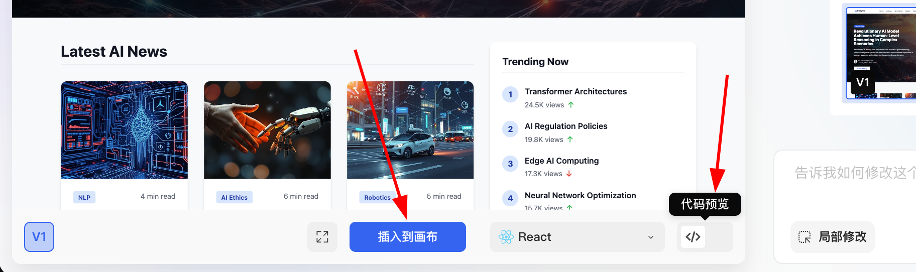
At this point, you have two options:
- Click the blue button to insert the generated result directly into the canvas
- Open the code preview and get the code for the full current page
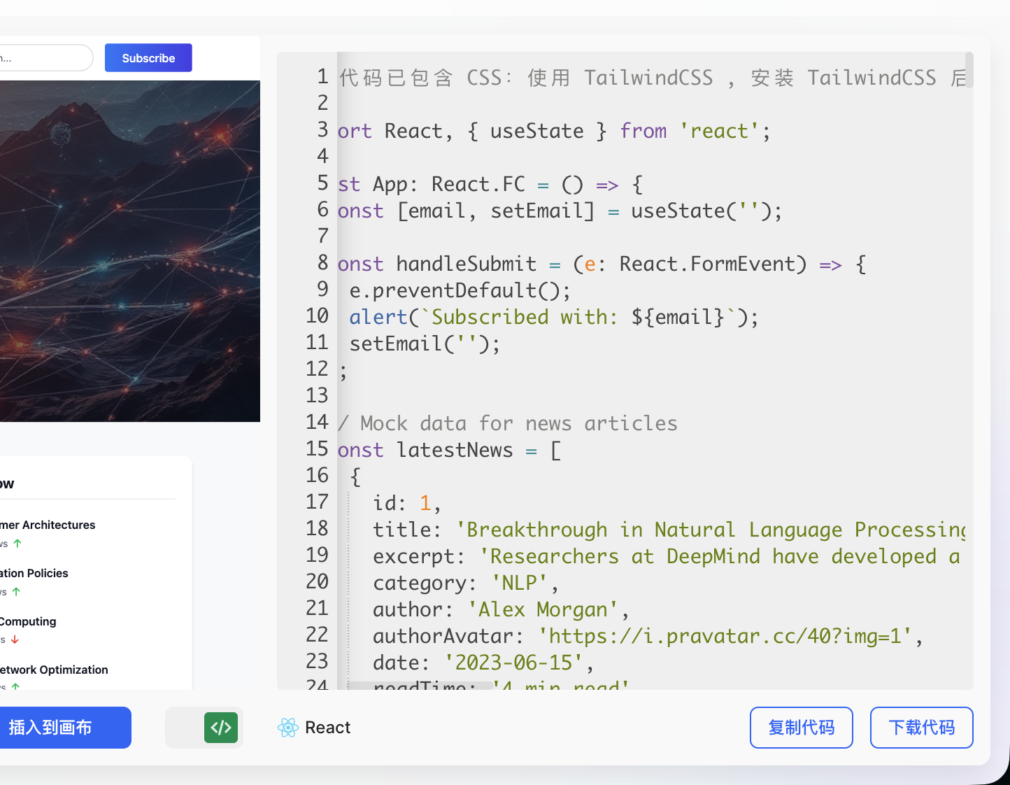
After inserting the result into the canvas, you can further refine the overall layout and element details such as typography, colors, and spacing until the final result matches your expectations.
4. Next step: from prototype to code
In this chapter, you learned the basic operations of both Figma and MasterGo and created structurally complete interface prototypes. The next key question is:
How do you convert these design drafts into frontend code that actually runs in the browser?
Next Tutorial
For the detailed workflow, continue with From Design Prototype to Project Code. You will learn:
- Direct multimodal AI conversion: send screenshots of your design to AI and generate HTML or React code directly
- Figma Make: use Figma's official AI tooling to recreate a design precisely and export code
- MasterGo AI: generate editable pages and retrieve code in one step
Each method has strengths and trade-offs, so choose the workflow that fits your project.
5. Summary
After finishing this chapter, you should now understand:
- Why frontend design tools matter: They solve problems around information layout and team collaboration, not just visual output.
- Basic Figma operations:
- Creating Design files and Frame artboards
- Adding text, shapes, and other basic elements
- Using Auto Layout for adaptive layouts
- Creating reusable component systems
- Basic MasterGo operations:
- Understanding an interface layout similar to Figma
- Creating Frames and basic artboard content
- Using AI page generation to prototype faster
Next Step
Now that you know the basics of modern frontend design tools, you can try:
- Designing a personal portfolio page for yourself
- Designing prototypes for your next project
- Continuing to From Design Prototype to Project Code to turn designs into runnable code
If you are working through the Let's Build Hogwarts Portraits project, you can start by designing the interface prototype, then export code and combine it with AI conversation features.