Build Your First Modern Application - UI Design
Remember the feeling of stumbling upon a beautifully designed product page for the first time? Even with similar features, other people's pages just look more "premium": clean colors, comfortable whitespace, perfectly rounded buttons. You can't help but wonder — "How did they design that? Can we make pages like that too?"
That urge to "figure out how others do it" is exactly the best starting point for frontend design. Before diving in, let's recap what we've already mastered:
- In earlier lessons, we learned to batch-generate design assets with NanoBanana and understood how "style" in a prompt shapes the final output;
- We got to know professional design tools like Figma and MasterGo, and how a design file is organized;
- We also saw the pipeline of turning a design file into frontend code.
But when you actually need to build a decent page for your own project, you may still get stuck: you know how to use the tools and can generate assets, yet you don't know what "good-looking" looks like, let alone how to break down and imitate an excellent page. Don't worry — this lesson is dedicated to exactly that problem.
To help you connect everything, think about a few small questions first:
- What sections does a modern web page typically consist of?
- Is "good-looking" a subjective feeling, or something that can be quantified into numbers (color values, font sizes, spacing, corner radii)?
- If you had to imitate a website's visual style, where would you start?
If you don't have clear answers yet, that's fine — that's exactly what this lesson will teach you. If you run into steps you find hard to follow, feel free to screenshot the current page and ask a large language model; don't be afraid to experiment and make mistakes — every attempt is a chance to learn and improve.
🎯 Core Question
When faced with a beautifully designed app or website, how do you analyze how it was designed, and use AI design tools to recreate it until it's indistinguishable from the original?
What You'll Learn in This Lesson
- Learn to "see" design: when you get a page, know what to look at and how to break it down
- Master an entry-level methodology: find references → analyze → imitate → match → get started
- Get to know 2 design routes: Figma/MasterGo and Claude Design/Open Design (including UI design Skills)
- Hands-on imitation: pick a real web page and take it from scratch to a high-fidelity handoff
- Consolidate a design system: turn big-tech design rules into your own
📚 Prerequisites
This tutorial suits developers who already use AI coding tools (such as Trae) and want to round out their frontend visual skills. If you want to build a feel for image generation first, we recommend starting with NanoBanana Asset Production; to go deeper into design tools, combine it with Figma and MasterGo Basics.
Chapter 1: Frontend Design Starts with "Copying"
In the previous section we raised three questions — what sections a page consists of, what "good-looking" means, and how to imitate. This section starts with the methodology: the first lesson of frontend design is not creation, but replication.
Just as you copy calligraphy masterpieces to learn calligraphy, or draw plaster casts to learn drawing, why exactly "copying"?
- The "goodness" of design can be quantified — color values, font sizes, spacing, corner radii, shadows are all numbers
- When you replicate a mature design pixel by pixel, you're forced to understand every decision behind it
- Once you can "match the original", the next time you face a similar scenario, you'll know "which direction to copy from"
💡 In one sentence: being able to imitate a great product means you already have the fundamentals of frontend design; being able to modify it on top of that means you've truly graduated.
1.1 Why Imitation Is the Fastest Way to Get Started
Some people worry: "I'm copying someone else's work — can I really learn anything?" The answer is: yes, and it's the fastest path. That's because imitation isn't about copying the result, it's about forcing yourself to reconstruct the process:
- You're forced to measure every gap, and thus understand "how whitespace creates breathing room"
- You're forced to look up every color value, and thus understand "why this palette looks harmonious"
- You're forced to compare every layer of hierarchy, and thus understand "how primary and secondary information is arranged"
When you can "break an excellent page down to parameter level" and rebuild it, your understanding of design already surpasses many people who only design "by feel".
1.2 Even the Big Players "Reference" — It's Not a Secret
Referencing is naturally part of a designer's workflow: Pinterest for inspiration, Dribbble for trends, competitor analysis for structure. The AI era has amplified this — because tools turn "referencing" directly into an executable capability:
- Claude Design can import reference sites you've saved and generate first drafts in their style
- Open Design ships 151 open-source design systems you can apply to your project with one click
- Various UI design Skills package "big-tech visual rules" into AI-executable instructions
So your question shouldn't be "can I copy", but "how do I copy professionally, legally, and end up with something of my own".
Where to Find References? Bookmark These Sites First
The first step of referencing is building a "reference library". The sites below are grouped by purpose — bookmark them all and use them as needed:
| Site | Purpose | What to look for |
|---|---|---|
| Awwwards | The "Oscars" of the web design world | Top-tier creativity, motion, and interaction — learn what the "ceiling" looks like |
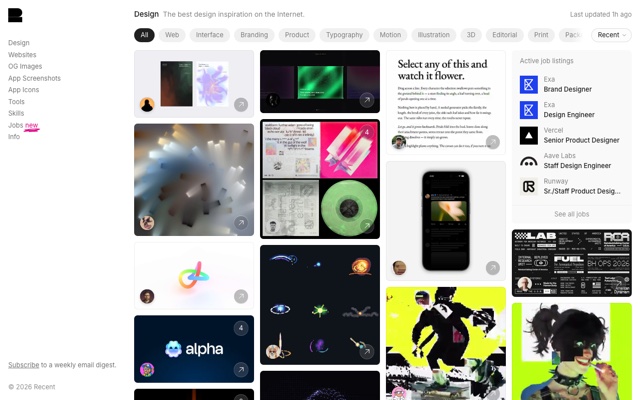
| Recent (formerly Godly) | High-quality web inspiration gallery | Cutting-edge design for AI, Web3, and portfolio sites |
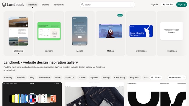
| Landbook | Curated landing page designs | Filter official sites, pricing pages, and hero layouts by industry/color scheme |
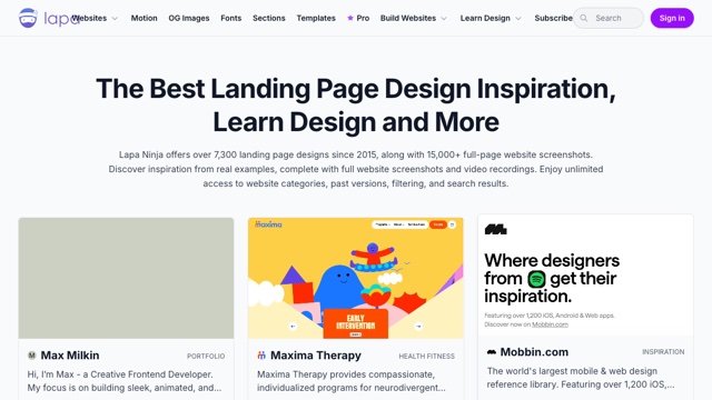
| Lapa Ninja | A library of 7300+ landing page screenshots | Look up navigation, feature showcases, and customer testimonials by element |
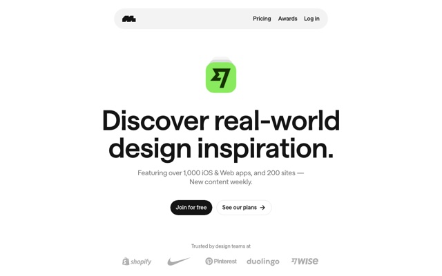
| Mobbin | Real app interface library | Study real pages and flows of products like Uber and Notion |
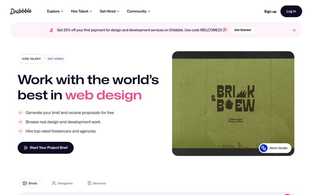
| Dribbble | Designer community | Color palettes, icons, illustration styles, and micro-interaction inspiration |
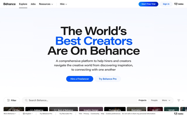
| Behance | Complete project case library | Design thinking, research process, and full portfolios |
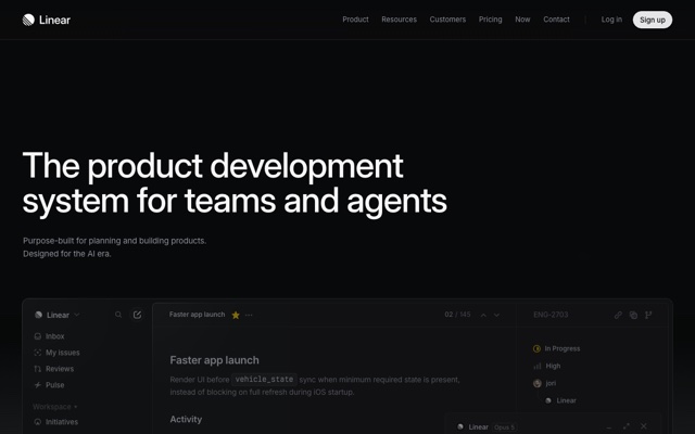
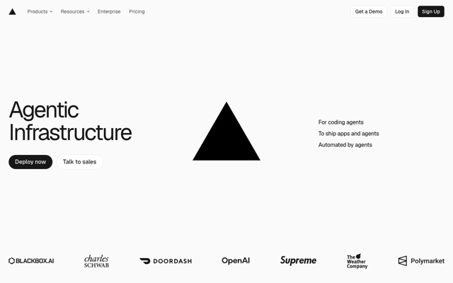
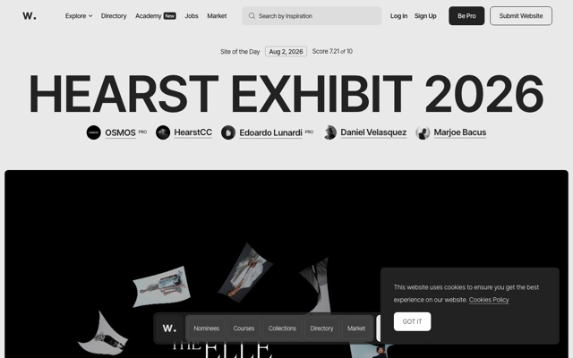
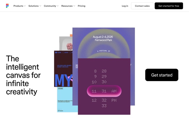
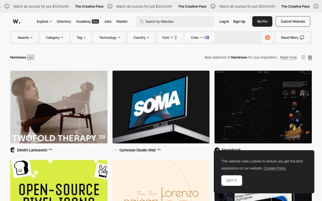
What do these sites look like? Take a sneak peek (click the images to enlarge):
💡 Build Your Own Reference Library
When a page catches your eye, screenshot it and save the link immediately, then file it by "landing page / component / color scheme / motion". When you imitate, pick targets straight from this library — it's much faster than searching online on the spot.
1.3 Reference vs. Copying: A Clear Line
| Dimension | Reference (recommended ✅) | Copying (dangerous ❌) |
|---|---|---|
| Target | Layout structure, visual style, design rules | Brand logos, proprietary icons, original illustrations |
| Method | Rework after understanding, blended into your own product | Directly copying assets, code, and images |
| Result | Feels like the style, but content is completely different | Even the copy, colors, and assets are identical |
| Risk | Low | High copyright/commercial risk |
Chapter 7 will cover copyright boundaries in detail; for now, remember one sentence: copying "rules" is fine, copying "results" is dangerous.
Chapter 2: See It First, Then Design — Breaking Down a Page
The premise of "matching the original" is "understanding what you see". This chapter gives you a universal framework for breaking down any page.
2.1 Look at the Structure: What Sections Make Up a Page
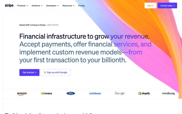
The vast majority of modern web pages can be broken into 4 major blocks:
┌─────────────────────────┐
│ ① Navbar                 │  Logo · Menu · Login/CTA
├─────────────────────────┤
│ ② Hero                   │  Headline · Subheadline · Primary Button · Product Shot
├─────────────────────────┤
│ ③ Content Sections       │  Feature Cards · Data · Testimonials · Pricing
├─────────────────────────┤
│ ④ Footer                 │  Links · Copyright · Newsletter
└─────────────────────────┘
When looking at a page, don't focus on details first — sketch its "skeleton" with your eyes: which part is the navigation, which is the hero, how many segments are in the middle, and how many elements each segment has.
2.2 Look at the Visuals: 4 Quantifiable Elements
| Element | What to look at | How to record it |
|---|---|---|
| Color | What are the primary, background, and text colors | Pick the Hex values directly with a color picker |
| Typography | What font, size, and weight are used for headings/body | Check font-family/size/weight in the browser DevTools |
| Spacing | The whitespace between sections and inside cards | Note the common 8 / 16 / 24 / 48 px rhythm |
| Radius & shadow | The corner radius of cards and buttons and their shadow intensity | Check border-radius / box-shadow in DevTools |
💡 A Built-in Advantage of Frontend Design
As a frontend developer, DevTools is your design analyzer. Right-click → Inspect, and the color values, font sizes, spacing, and corner radii of any page are fully exposed. This is an ability designers dream of, and developers are born with.
Common color-picking tools: the color picker in Chrome DevTools, color-picker type extensions; you can also throw a screenshot at a multimodal LLM and let it extract the design specs for you.
2.3 Look at the Components: Break Out "Reusable Parts"
Break the page into components and record each component's style parameters:
Button (Primary)
- Background: #4F46E5
- Text: #FFFFFF, 14px / 600
- Border radius: 8px
- Padding: 12px 24px
- Shadow: 0 2px 8px rgba(79,70,229,0.3)

Card
- Background: #FFFFFF
- Border radius: 16px
- Border: 1px solid #E2E8F0
- Shadow: 0 4px 12px rgba(15,23,42,0.08)
After breaking down 3-5 pages, you'll have a "component style library" in hand — that's the seed of your own design system.
2.4 Translate "What You See" into "Language AI Understands"
To imitate in an AI tool, you need to translate visuals into structured descriptions. The closer you look, the more accurate the translation, and the better the AI imitates.
Follow the style of this landing page and build a page with the same structure:
- Structure: navbar + hero + 3 feature cards + pricing section + footer
- Colors: primary Indigo #4F46E5, background #F8FAFC, text #0F172A
- Typography: headings Space Grotesk 700, body Inter 400
- Spacing: sections 96px, cards 24px, grid 24px
- Radius: cards 16px, buttons 8px
- Shadow: 0 4px 12px rgba(15,23,42,0.08)
Chapter 3: A Panorama of Frontend Design Tools in the AI Era
"How did they design that?" The answers are increasingly diverse. Here are 2 typical routes, spanning from "manual fine-grained control" to "conversational auto-generation".
3.1 Route 1: Figma / MasterGo — Professional Design Tools
If what you need is an editable, collaborative, pixel-level controllable design file, use Figma (the international mainstream) or MasterGo (domestic, lighter learning curve):
- Lay out, adjust components, and build interactive prototypes on the canvas
- Use capabilities like Figma Make / MasterGo AI to assist generation and batch adjustments
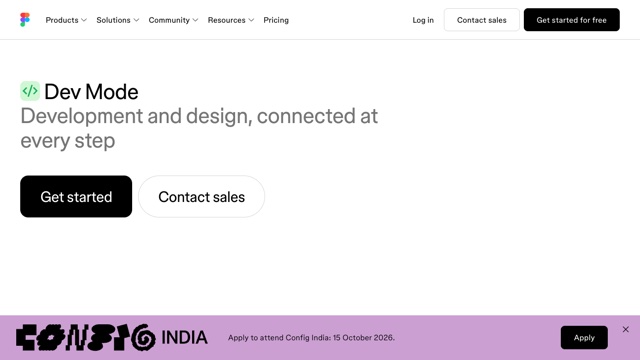
- Finally hand the design file to frontend developers to implement, or convert to code via plugins
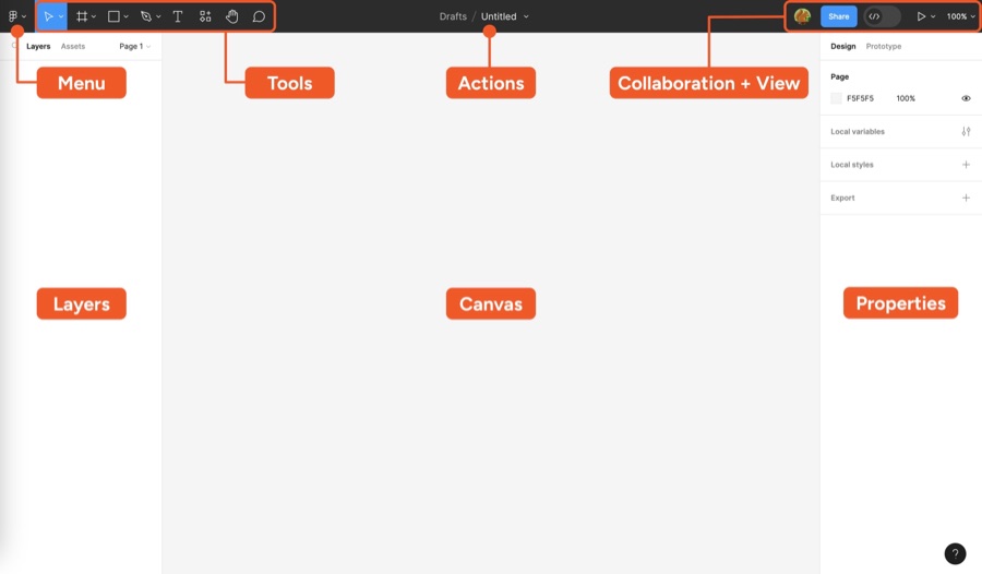
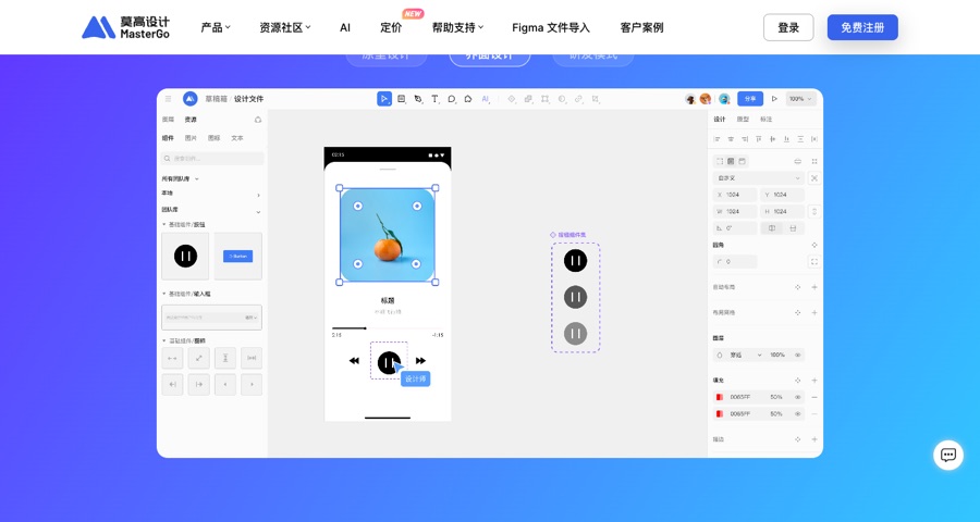
Best for: scenarios that need strict design-file handoff, team collaboration, and complex interaction. For tool operations, see Figma and MasterGo Basics.
3.2 Route 2: Claude Design / Open Design — Conversational Design Canvas
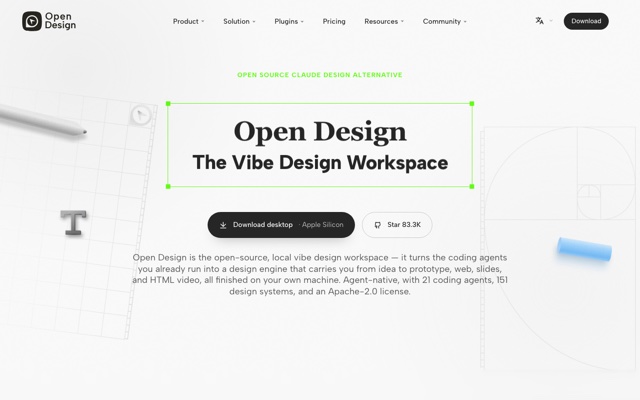
What these tools have in common is generating interactive design prototypes directly from natural language, rather than static images. The representative tools are Claude Design and its open-source alternative Open Design.
Claude Design: The Official Conversational Design Canvas
Claude Design is an AI design product from Anthropic (entry point claude.ai/design):
- Type a one-line requirement and get 3 design variants by default, covering landing pages, wireframes, presentations, and more
- Supports importing design systems (GitHub repos, Figma exports, website screenshots, brand files) and automatically extracts colors/fonts/components
- Comment and tweak directly on the canvas with drag-and-drop fine-tuning, then export HTML / PDF / PPTX, or hand off to Claude Code to implement as real code
Typical use cases:
① Recreate a high-fidelity page directly from a reference screenshot (most common)
Describe your product and style reference, and Claude automatically generates a complete landing page — the conversation on the left logs the prompt and generation process, while the canvas on the right renders the result in real time.
Create a high-fidelity landing page designed to raise $500,000 from angel investors
for "雾屿咖啡 Mist Island Coffee" - a boutique specialty coffee shop that combines
premium coffee, quiet workspaces, and warm community events.
Tone should feel warm, premium, calm, and trustworthy - think a mix of Blue Bottle
Coffee + Apple Store + minimalist lifestyle design.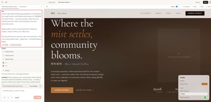
② 3 design variants by default — pick a direction, then refine
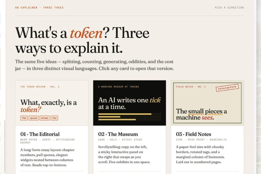
Claude Design doesn't give you just one answer; it generates multiple directions to choose from by default — editor style, museum style, Zine style, etc. Click into one and refine it.
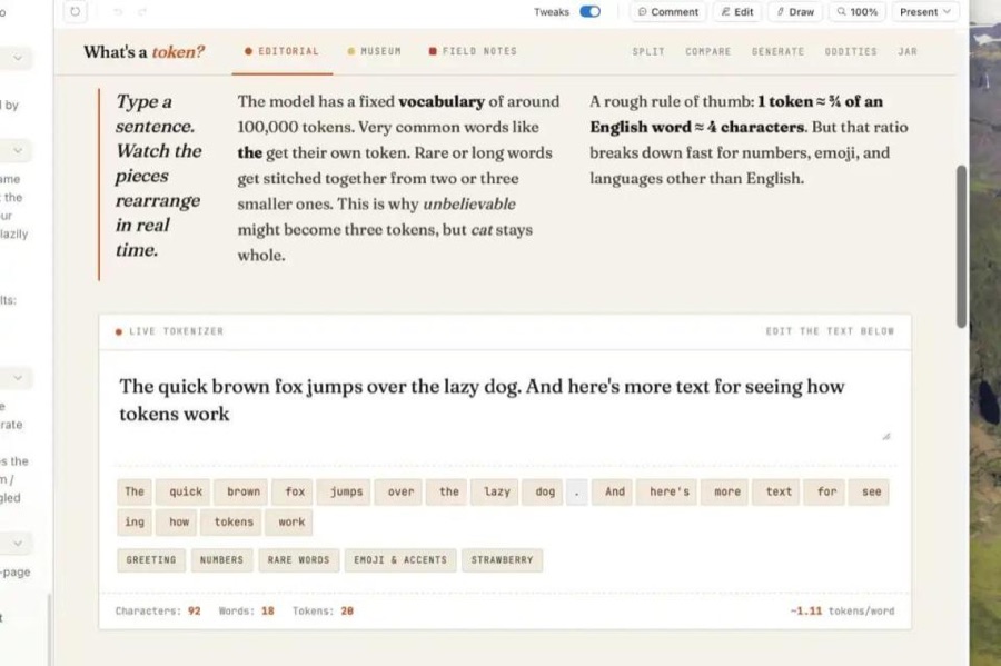
③ Generate interactive prototypes (not just static images)
The generated pages are genuinely clickable, typeable HTML — buttons have hover effects, forms accept input, and data is computed in real time.
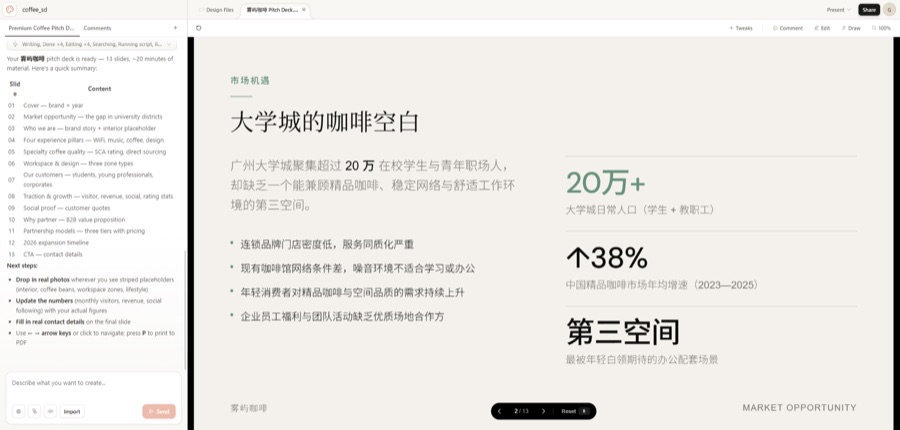
④ Build product presentations / PPTs
Beyond web pages, it can generate full slide decks (multi-page, with navigation, exportable as PDF/PPTX).
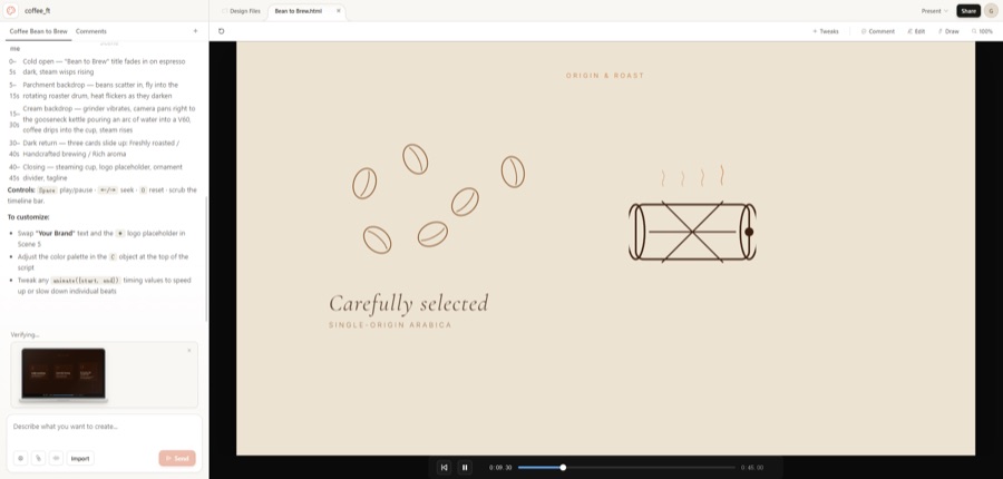
⑤ Generate animated videos
Through "From template" you can create animated HTML videos — storyboard script plus actually rendered animation frames, with a playback control bar.
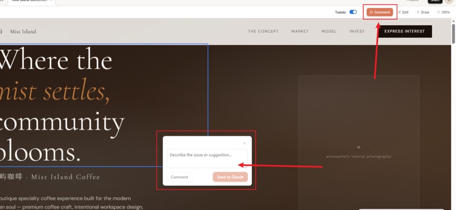
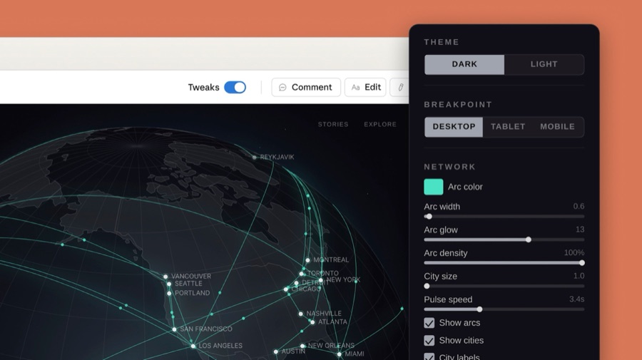
⑥ Iterate on existing designs (comment directly on the canvas)
After generating a prototype, no need to rewrite the prompt — click the Comment button, circle an element, write a comment, and Claude will make local changes.
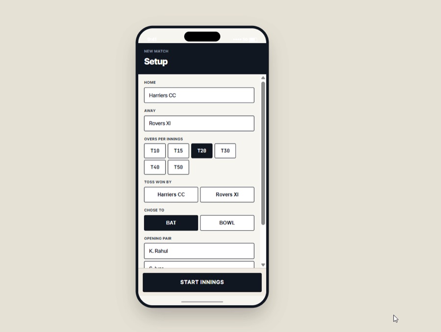
⑦ Mobile app page design
Supports specifying a device size (such as iPhone) and generating mobile UI prototypes with device frames.
Best for: people without a design background who want to skip the Figma learning curve and quickly get interactive prototypes.
Open Design: The Open-Source Alternative to Claude Design
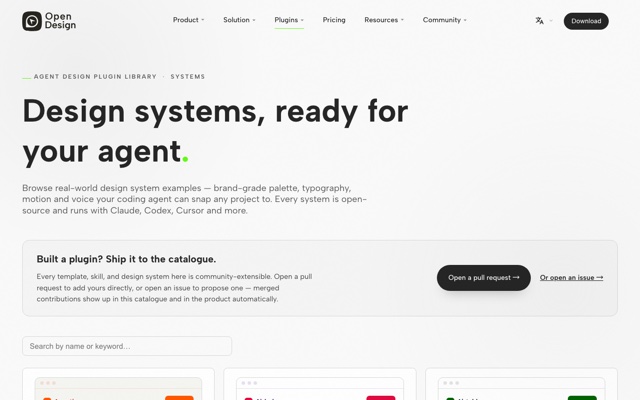
If you don't want to subscribe, or care more about data privacy, try Open Design (the nexu-io open-source project). It follows the same route as Claude Design: conversational generation of design prototypes — with the difference of being local-first, BYOK (bring your own model key), and not tied to any agent.
It has two core concepts:
| Concept | Description | Value to you |
|---|---|---|
| Skills | 16 instruction-based design skills (copywriting, color palettes, creative direction, brainstorming…) | One skill = one professional task template |
| Templates | 288 runnable templates (prototypes, slides, motion…), each with an example.html | Fork one, swap in your data, and you're ready to deliver |
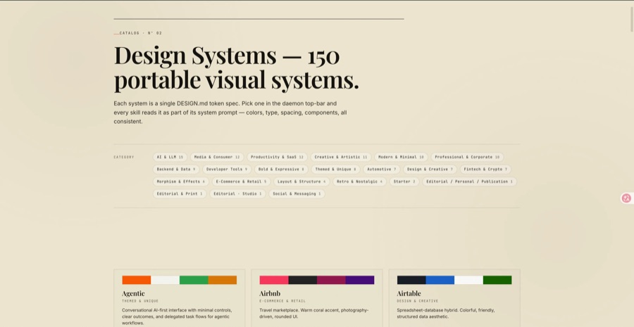
| Design Systems | 151 portable design systems (color palettes, typography, motion, writing style) | Apply a big-tech visual spec with one sentence |
It detects your local coding agent (Claude Code, Codex, Cursor, Qwen, Kimi, etc. — officially 21 supported) as the "design engine" — your existing agent is the designer. In addition, UI design Skills in ecosystems like Claude Code (e.g., frontend-design) can package design rules into AI-executable instructions, so the AI outputs follow the specs.
Typical use cases:
① New project: pick a Skill + design system + fidelity
When creating a prototype, you can choose wireframe or high fidelity, specify the target platform (responsive web / mobile, etc.), and pick one of the 150+ built-in design systems as the visual foundation.
Use Open Design with the Linear design system to generate a landing page HTML for a SaaS product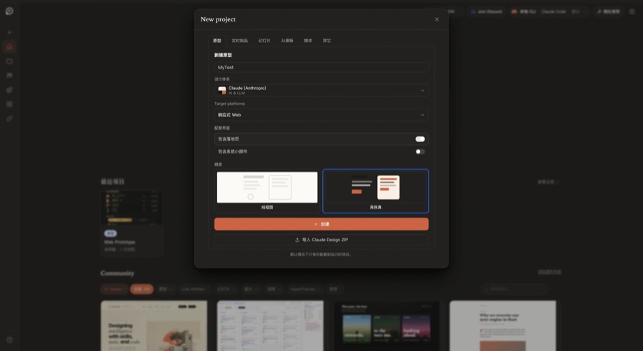
② Studio workspace: conversation-driven, real-time generation
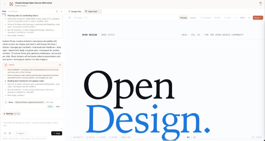
The left side is a conversation panel (showing the AI's thinking steps, Todo list, and Write operations), and the right side is an iframe canvas rendering the output in real time — similar to Claude Design, but the bottom shows which local CLI agent is being called (Claude Code, Codex, deepseek, etc.).
③ Apply a design system to generate slides/PPT
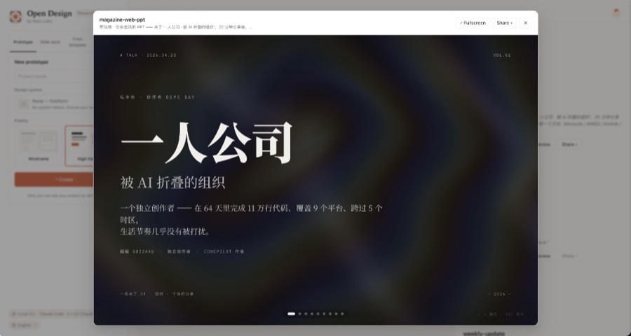
Select the Slide deck type, enter a topic, and it generates a complete multi-page deck. Below is a Chinese talk deck generated by a community user with Open Design.
④ Generate high-fidelity mobile app prototypes
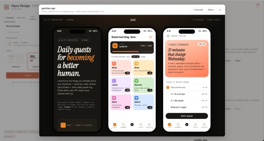
Supports previewing multiple screens at once, automatically generates iPhone device frames, and includes tab bars, card layouts, progress bars, and other components out of the box.
⑤ Use UI design Skills to standardize AI output
Install a Skill like frontend-design in Claude Code / Cursor, and the AI will automatically follow the design specs when writing pages:
# Call inside Claude Code
/frontend-design implement a login page for me
→ Automatically outputs following the Skill's built-in design specs:
   - Colors: primary #4F46E5, success #10B981, error #EF4444
   - Spacing: 8px base grid
   - Components: accessible Button / Input / Form
   - Responsive: mobile / tablet / desktop
⑥ Local private projects never leave the network
For in-house projects or product designs containing sensitive data, all files are processed locally, and models can be run via local deployment or BYOK:
# Start Open Design locally, with a locally deployed Qwen model
OPENAI_API_KEY=your-local-key OPENAI_BASE_URL=http://localhost:8000/v1 \
opendesign
# All design files are saved locally in ~/.open-design/, never passing through any third-party server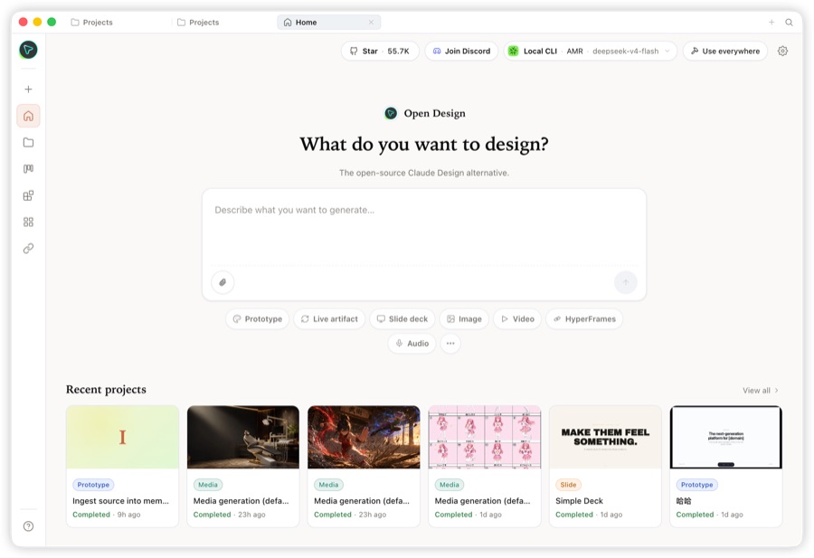
Best for: developers who value data privacy, already have a coding agent, and want full control over the design process.
3.3 How to Choose Between the Two Routes
| Comparison | Route 1: Figma / MasterGo | Route 2: Claude Design / Open Design |
|---|---|---|
| Positioning | Professional design-file tool | Conversational AI design canvas |
| Representative tools | Figma, MasterGo | Claude Design (official), Open Design (open-source alternative) |
| Output | Editable design files | Interactive HTML prototypes |
| Learning curve | ⭐⭐ Medium | ⭐ Low |
| Cost | Free tier available | Claude Design requires a subscription; Open Design is open source and free (BYOK) |
| Best for | Rigorous handoff and collaboration | Rapid prototyping, privacy first |
💡 Real-World Combined Usage
Reference → Design → Deliver can be mixed throughout: use Claude Design / Open Design to quickly get directions and prototypes → import into Figma/MasterGo for fine-tuning once finalized → hand off to Claude Code to write the code. Each route complements the other.
Chapter 4: Hands-On 1 — Imitating "Someone Else's Web Page" to Match
The goal is concrete: pick a real web page you like and imitate it until it "matches". We'll use a landing page as the example here.
Step 1: Pick a Target
Choose a landing page with clear structure that interests you (a SaaS homepage or product intro page works). Save its screenshot and link.
Step 2: Break It Down with the Chapter 2 Framework
Right-click → Inspect in the browser, and record in 4 steps:
Target: some SaaS official website landing page
① Structure: navbar(Logo/Menu/CTA) → hero(headline/subheadline/button/screenshot) → 3 feature cards → pricing(3 tiers) → footer
② Colors: primary #0F172A dark, accent #6366F1, background #FFFFFF / #F8FAFC
③ Typography: headings Inter 800 48px, body Inter 400 16px
④ Components: buttons radius 8px/solid, cards radius 16px/light gray background/no border
Step 3: Feed It to an AI Design Tool and Generate the First Version
Hand the breakdown to Claude Design / Open Design and have it generate according to these specs:
Generate a landing page with the same structure following these design specs:
[paste the Step 2 breakdown notes]
Product: my project (one sentence describing its purpose)
Requirement: follow the color, typography, spacing, and radius specs above at the pixel level
The first version is usually "close in spirit but not in form" — the structure is right, but the details deviate. That's not failure; it's exactly what tells you where to adjust next.
Step 4: Compare Section by Section and Iterate
Put the reference screenshot and the generated result side by side, compare section by section, and use "modification commands" to close the gap:
| Issue found | Modification command |
|---|---|
| Primary color too bright | "Change the primary color to #0F172A and the accent color to #6366F1" |
| Button radius wrong | "Give all buttons a uniform 8px radius with a solid background" |
| Spacing too tight | "Change section spacing to 96px and card padding to 24px" |
| Typography wrong | "Switch headings to Inter 800 and body text to Inter 400" |
| Too many decorative elements | "Remove the background decorations and keep only the core content" |
Step 5: Acceptance Criteria — "Match"
How do you know you've gotten started? Set an objective standard for yourself:
- [ ] Take two screenshots: the original page vs. your imitation
- [ ] Enlarge both side by side and compare pixel by pixel
- [ ] Color values, font sizes, spacing, and corner radii show no visible layout difference
- [ ] Zoom out to 50% and compare again — you still can't tell which is the original
💡 "Matching" isn't the goal; it's the means. After imitating 2-3 completely different styles of websites, you'll naturally accumulate a "design feel": when to use generous whitespace, when to go high saturation, when to tone down the corner radii. By then, imitating a new page will be much faster.
Chapter 5: Hands-On 2 — From Design to Code
The imitated design/prototype eventually has to become a real page in your product. Two handoff paths:
5.1 Path A: AI Design Tool → Frontend Code
- Claude Design: after finalizing on the canvas, use
/design-syncto sync to Claude Code and continue writing code directly from the design, without redoing it from screenshots - Open Design: export HTML directly, then have an agent refactor it into project components
- Figma/MasterGo: export React / Vue code via plugins or MCP
5.2 Path B: Screenshot → Multimodal LLM Reconstruction
Simplest approach: drop the finalized design screenshot directly into a multimodal LLM, "reconstruct it as React components", and land it section by section.
For a detailed comparison of the three "design-to-code" paths, see From Design Prototype to Project Code. For component-level engineering efficiency, also check out Updating Your UI with a Modern Component Library.
Chapter 6: Make a Big-Tech Design System Your Own
After imitating 3 pages, you'll find: every good-looking page sits on a stable "design system". Instead of building one from scratch, stand on the shoulders of giants.
6.1 What Is a "Portable Design System"
Open Design turns design systems into DESIGN.md files (Linear, Vercel, Stripe, Apple, Cursor, Figma…), while Claude Design extracts them automatically from your code repos/design files. At their core, they're the same thing:
DESIGN.md = color tokens + typography rules + spacing rhythm + component styles + usage conventionsA real example structure:
# Design System: Linear

## Colors
- background: #08090A
- primary: #5E6AD2
- text: #F7F7F8

## Typography
- heading: 22px / 600, letter-spacing -0.4px
- body: 14px / 400

## Radius
- card: 8px
- button: 6px

## Spacing
- 4 / 8 / 12 / 16 / 24 / 32 px

## Do / Don't
- Do: generous whitespace, restrained use of color
- Don't: no gradients, no stacked shadows
6.2 Three Steps to Build Your Own Design System
- Pick a foundation: apply a big-tech design system you approve of (e.g., Linear's restrained dark style, Apple's whitespace)
- Tweak the parameters: replace the primary color with your brand color, adjust corner radii and spacing
- Consolidate into a file: save it as a
DESIGN.mdor Skill so AI automatically follows it on every generation
6.3 Go Further: Pin Down Your Style with a UI design Skill
Once you package the design system into a Skill, one sentence is enough to invoke it:
Use the my-brand skill design specs to generate hero concepts for 3 feature pagesFor how to create and use Skills, see Making Your UI Beautiful with LLMs and Skills.
Chapter 7: Copyright and Ethics
The stronger your imitation skills, the more you need to hold the line:
Copy rules, not results. Layout, color palettes, spacing — these "rules" are fine to learn; logos, icons, illustrations, and copy — these "results" should not be copied directly.
Be cautious with commercial projects. Before commercial delivery, confirm: asset copyrights, font licenses (commercial fonts need to be purchased), and the terms of use of reference sites.
Attribution of AI-generated content. Different platforms (Claude Design, Open Design, etc.) have different terms — check the service agreements before commercial use.
Disclose AI involvement. Some platforms/regulations require disclosing that content was generated by AI.
Final gatekeeping. For sensitive scenarios like brand identity and ad materials, always do a manual review.
💡 Suggestion
Feel free to imitate freely during the learning and prototyping phase; when entering commercial delivery, turn "reference" into "re-creation based on your own design system" and keep the generation records.
Summary
This chapter turns "getting started with frontend design" into an executable path:
- Mindset: frontend design starts with "copying" — copy rules, not results
- Seeing: break down any page in three layers — structure (4 major blocks) + visuals (color/typography/spacing/radius) + components, with DevTools as your analyzer
- Tools: 2 routes — Figma/MasterGo (fine-grained design files), Claude Design / Open Design + UI design Skills (conversational prototypes)
- Imitate: pick a target → break down → generate → iterate section by section → pixel-level acceptance comparison
- Consolidate: turn a big-tech DESIGN.md into your own design system, then pin it down with a Skill
💡 Next Step
Complete one full imitation exercise today:
- Find a landing page you want to "copy", and use DevTools to extract its colors/typography/spacing/radius
- Generate the first version with Claude Design or Open Design, and iterate section by section until it "matches"
- Hand the finalized design to AI to turn into code, and save your own DESIGN.md along the way